An Unconventional Brunswick Edwardian, Revamped With Bold Blue Interiors
Interiors
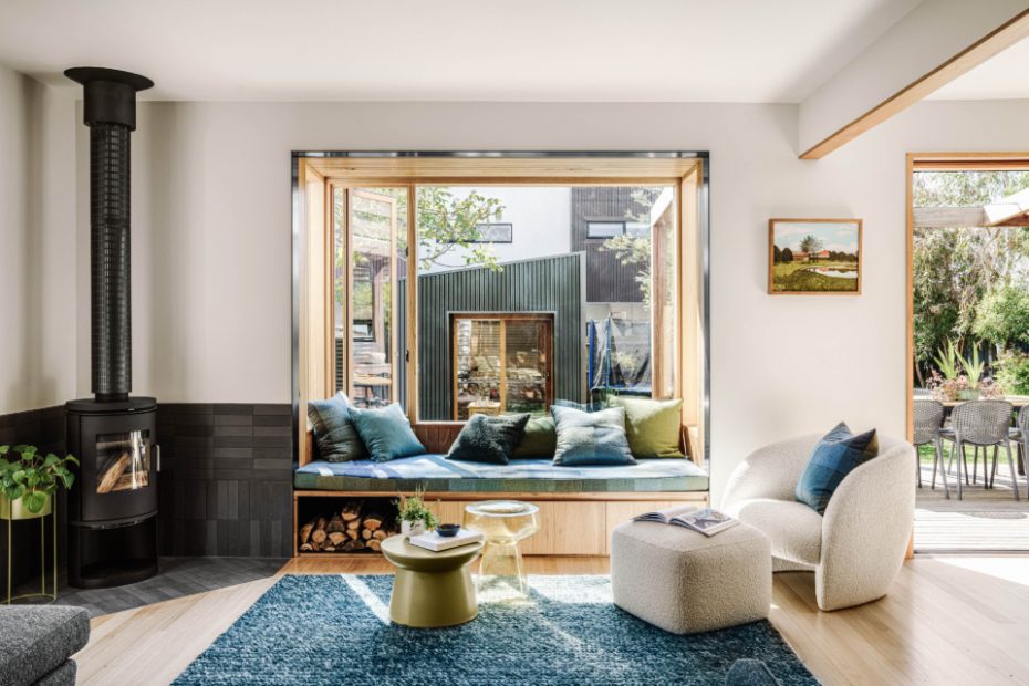
The open living room in Blue Larnoo by Brave New Eco.
Blue accents reflect the owner’s favourite colour throughout.
Pop and Scott dreamweaver pendant. Painting from House Of Orange.
The kitchen revolves around a blackbutt timber island bench with a curved tiled return.
Deeper shades of blue were used to create a moodier atmosphere throughout.
A custom resin showerbase is contrasted with the terrazzo floor tiles in the ensuite bathroom.
Light timber joinery brings a warmth to the cool blue backdrop.
The spotted gum deck was built connecting the indoor kitchen to a custom-designed outdoor kitchen, with its own sink and BBQ.
A nook between the OSB-clad shed is cleverly used to store wood for the fire inside.
The view from the back lane.
A skylight transforms the bike shed into its own hang-out space – it’s easy to see why the builder has dubbed it ‘Melbourne’s most epic bike shed’!
With layered interiors and a calming blue colour palette, this renovated Edwardian home in Brunswick West has been completely transformed by Brave New Eco.
‘When [our clients] Maggie and Pete bought their Brunswick West home, it looked and functioned like two single-fronted Victorians, with two kitchens, two dining rooms, two laundries, two everything!’ Brave New Eco design director Megan Norgate says.
It was sporting a curious ‘dual living’ set-up thanks to a renovation from the previous owners, two brothers who had lived side by side in the property. Their conversions had left a maze-like floorplan inside the double-fronted, double-storey property, with extra doorways, hallways, and pokey rooms that needed to be consolidated to suit the family of five.
‘Our brief was to unite the spaces with a practical flow that would create a sense of openness and connection to the north-facing backyard,’ Megan says.
The inspiration for the playful blue palette throughout came directly from Maggie. ‘It is her favourite colour, and as we started to explore, she came back to blue again and again,’ Megan adds.
‘There are deeper tones in moodier rooms for retreating, and lighter tones in other spaces. Paired with charcoal, green, and small pops of orange and yellow it has a unifying effect to the whole home and creates a lovely backdrop for the family’s artworks and objects.’
Many materials and features of the home were given a cosmetic transformation and retained, rather them being replaced altogether. The builders painstakingly sanded back a shiny yellow sealant on the Victorian ash floorboards to reveal a more natural finish, and the ‘daggy banisters’ and existing trims were painted for more contemporary feel.
They also removed the twin kitchens and turned the two ‘halves’ at the extended rear into a light-filled living room and sophisticated kitchen — with a curved blackbutt and porcelain bench, deliberately big enough for all three kids to sit and do their homework. The adjoining wall was replaced with two curved openings lined in hardwood, connecting the areas without the need for an obvious structural beam.
It’s the combination of all of these thoughtful design decisions that have turned the ‘humble’ floorplan into a joyous family home with cosy, lived-in interiors and a strong connection to the lush back garden.
‘The bay window creates a sunny reading nook, and also has a fun secret projector screen hidden in a recessed pelmet,’ Megan says. ‘Maggie and Pete now spend most of their summer evenings outside on the deck — it is one of their favourite spaces.’
Want to see more from The Design Files? Sign up to our newsletter for your weekly dose of home and design inspiration here!
