Two Unique Garden Studios Inspired By Japanese Architecture, and Robin Boyd
Architecture
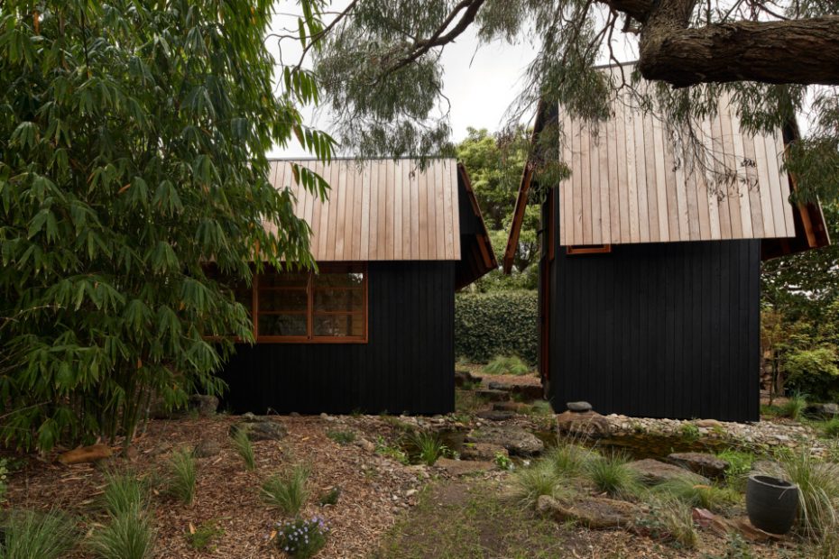
Ember by MRTN Architects is a pair of garden studios alike in appearance but with very contrasting purposes.
The two small studios are hidden at the bottom of the garden.
Hugh’s studio.
The landscaping was designed by Sam Cox.
The studios sit apart from the home.
It was inspired by Japanese tea rooms.
The exterior of the studios is constructed from cedar and shou sugi ban-style burnt ash cladding.
The view from the house.
Hugh’s studio is a workshop.
Here he does digital illustration, reads his books and builds small objects.
The studios also have a shared kitchen out the back.
‘The carpentry involved was both complex, dirty and repetitive — and all undertaken by one carpenter, Rod Greaves,’ says Hugh.
‘I love how the two spaces appear to be in communication with each other,’ says Antony Martin, of MRTN Architects.
In 2020, Lailani Burra and Hugh Marchant approached MRTN Architects with a truly unique pitch.
They wanted two studios built separate to their home, unified in their design and proximity, but with two very contrasting purposes.
For Lailani, a studio to ‘be’ rather than to ‘do’. She wanted, in essence, an empty room that could easily transform for its different uses; with the addition of a chair, it becomes a contemplative space; with a second chair or cushions, it becomes a space to talk; with a pilates bed or a yoga mat, it becomes a studio; when the drums come out, it becomes a place to make or listen to music; pull out the futon and it becomes a place for family and friends to stay.
‘I imagined thinking about doing work there, but not doing the work there,’ she says. ‘A place of light and shadows.’
Hugh’s couldn’t be more different in comparison. ‘It’s important that there is no light interference’, he says. His studio is a dedicated workspace; a digital illustration studio, a library and a small objects workshop.
He needed plenty of legroom and headspace; a ‘haven of imagination’ away from the house, where he gets distracted.
Armed with these contrasting briefs, Antony Martin, of MRTN Architects, allowed the purpose and inhabitant of each building to determine its form, both needing to be separate but with a connecting space between.
The design was conceived with two match boxes, one lying on its side, the other standing vertical, each with a conical hat on top.
Of course, there’s a lot more to these refined studios than two match-box like structures. ‘It was important that they referenced the Robin Boyd designed CHI home on the property,’ says Antony. ‘But not copy it or borrow from its elements, as the studios had to be placed within a garden, rather than perceived as an extension to the house’.
There was also a shared appreciation with the clients around the nature of traditional Japanese architecture — tea houses, in particular — for their specific function and the way they are sited within a garden space.
Lailani’s studio explores this concept by incorporating the very traditional Japanese elements of tatami matting and shoji screens.
Externally, the studios have a limited palette of cedar and shou sugi ban-style burnt ash cladding, and are surrounded by a calming landscape design of rocks, water and clever planting by Sam Cox, which connects everything together seamlessly.
‘I love how the two spaces appear to be in communication with each other,’ says Antony. ‘They each have an individual character to them… it’s like they have taken themselves off to the back of the garden so that they can share secrets.’
Want to see more from The Design Files? Sign up to our newsletter for your weekly dose of home and design inspiration here!
