This Revived Mid-Century House In Adelaide Seamlessly Blends Old + New
Architecture
Atikson Green is a renovated mid-century home by Northern Edge Studio.
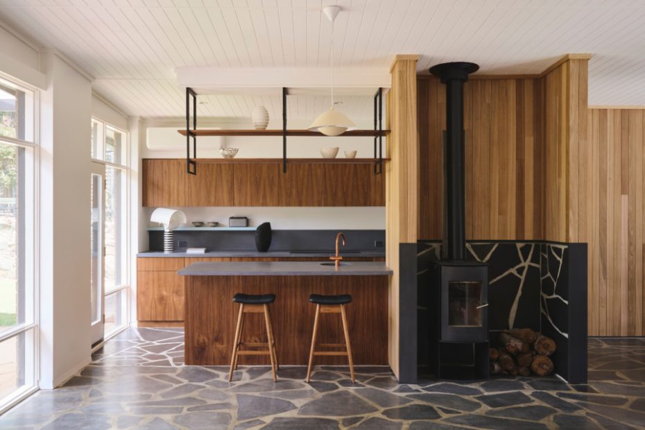
The updated kitchen features slate flooring and rich timber joinery. Kitchen stools from TH Brown. Ceramics throughout by Ringwood Arts Co.
Custom-made concrete bench tops by Create With Concrete. Joinery by Woodform.
Tapware by Sussex Taps. Sink by Copper Sink & Bath Company.
The new blackbutt timber cladding is contrasted with blue-toned joinery.
Fireplace by Nectre Fireplaces.
Original floor to ceiling windows flood the living room with natural light. Objects from Stylecraft. Art by Matthew Fortrose.
The home’s entrance.
Timber cream chair by Stoops. Rug by Hali Rugs. Floor lamp from Aura Objects.
Before its recent renovation, the structure of this 1960s Mitcham home had stood the test of time. But inside, some of its best mid-century features had been covered up by a series of cosmetic updates over the years.
The original owner, designer Margaret Meyler, worked with a German builder to create the home for her family of six.
The build used a unique selection of textural materials — think exposed brick, frames made from western red cedar, slate flooring, and ceilings covered in a ‘particularly beautiful’ compressed straw. Almost every surface featured natural finishes, filling the interiors with warmth.
‘You can imagine my dismay years later when I saw the window frames painted turquoise, not to mention all the bricks and straw covered with Gyprock!’ Margaret says.
Luckily, the home’s newest owners were fans of its mid-century roots and engaged design firm Northern Edge Studio for a more sympathetic, two-part renovation.
In 2021, director and architect Paul Cooksey designed a new pergola that mirrored the existing low-slung roof. The clients approached him again in 2022 for a transformation of the kitchen and laundry. They wanted to improve the kitchen’s connection to the living spaces, in addition to updating practical elements like the joinery, which was coming ‘to the end of its usable life’.
‘Our design process is always to minimise our architectural footprint, and to improve the existing home with small and beautiful touches,’ Paul says.
Simple changes like opening the kitchen up to the curtain wall at the rear of the property helped maximise space, while the new material palette was curated as a home to the original build.
They extended the original slate flooring into the renovated areas, even going to the effort to source the Wistow slate stone from the same quarry. ‘Similarly, the timber wall lining was a reference to the straw-panel ceiling that was initially there,’ Paul adds.
The natural Australian blackbutt timber cladding contrasts with the rich walnut-toned features, and small splashes of blue on the joinery also nod to the mid-century era. Everything has been carefully considered to create a seamless blend of old and new, building on the home’s enduring retro character.
‘Anytime we work on existing homes, we are attempting to prolong and enhance the life of that home so that it may serve as a cultural touchstone for the next generation and beyond,’ Paul adds. And in this project they’ve done exactly that, much to the delight of the owners of the past and present.
‘The clients love the new kitchen,’ Paul says. ‘They find the space functional, beautiful, and it renews their love of the home. Even the original owners [Margaret] has reached out to say how much she enjoys the renovation.’
