An Edwardian With A Modern Twist + Panoramic Garden Views
Architecture
The rear of the Armadale home was recently redesigned by Eliza Blair Architecture.
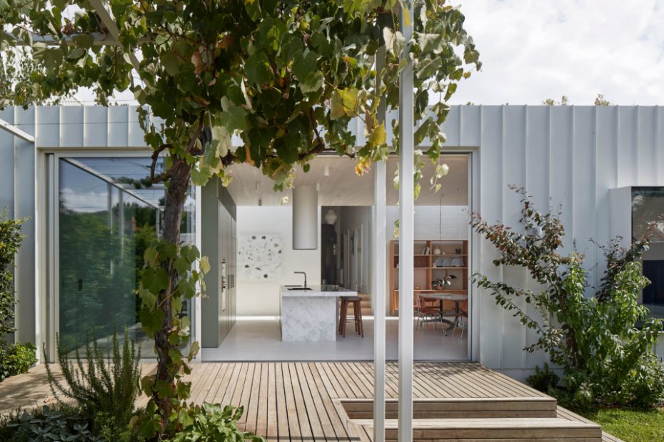
The view from the backyard. Double glazed powdercoated aluminium windows and doors by Alspec. Blackbutt decking with Cutek Grey Mist tint.
The project offers seamless indoor-outdoor living.
The statement green kitchen. Elba Honed benchtop from Artedomus. American oak veneer joinery stained to match Dulux Shire.
Glosswood lining boards on ceiling in satin white lime wash. Polished concrete overlay system on floors by Pangea.
The floorplan was designed to offer a sweeping sense of space.
A tranquil corner of the living room.
The charming facade.
Even the front door framing views of the garden.
The owner of this Melbourne home bought it in an unliveable condition in 2019.
She quickly undertook a three-month renovation to get the house up to scratch to move in with her two teenagers, before later engaging Eliza Blair Architecture to redesign the rear.
Behind the original red-brick facade and stained-glass window, the front door now opens to reveal period details at the front, a modern extension at the back, and a surprisingly leafy backyard.
‘The vision was for a light-filled single-level extension that seamlessly connected to the outdoors,’ Eliza says. It was paramount to capture these panoramic views for the client, who is who is an enthusiastic gardener.
This focus on the garden also inspired the material palette and the sustainable approach to the renovation.
In contrast to the timber floors in the front of the house, concrete floors and brick walls provide a contemporary edge and thermal mass in the new extension, in line with passive design principles that improve the home’s energy efficiency.
A skylight overhead also marks the break between the old and new, as natural light welcomes you into the sweeping area.
High-performance, double-glazed windows wrap around the room, filling the space with sunlight and greenery, while the green kitchen joinery echoes the lush hues of the backyard.
Eliza says the floorplan embraces modernist principles, creating a free-flowing perimeter around central ‘island’ elements. ‘This strategy also helped to optimise views of landscaped spaces and keep costs down due to the compact layout,’ she adds.
The resulting design is simple, but striking, showcased best in details like the cantilevered steel box window seat — wrapped in a soft olive green leather — that frames an outlook of the pool and garden.
Outside, a diverse mix of grassy plantings and trees envelop the extension in a calming sea of green that’s just as inviting as the house itself. BWLA designed the landscape with sustainability in mind too, ensuring the backyard conserves water and promotes bio-diversity for the inner-city block.
A hero of the garden is the new steel pergola. Not only does it provide sun shading and a visual link from the contemporary built elements into nature, but it also supports an old grape vine that the home’s previous owners had planted many years ago.
‘Herbs and citrus trees are all easily accessible off the deck, enhancing our client’s passion for gardening and cooking,’ Eliza says.
It’s these personalised touches that have improved the home dramatically, creating a place that successfully balances the property’s heritage with functional efficiency, and perfectly suits the owner’s lifestyle.
