A 1900s Sandstone Home Extension Inspired By The Nike Swoosh
Architecture
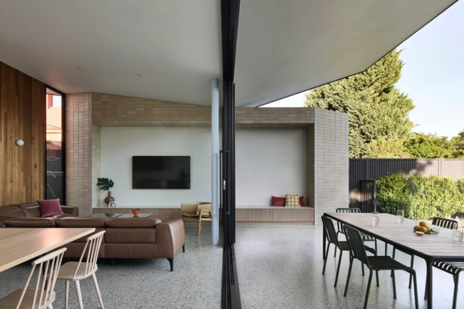
King Living lounge. Daniel Emma brown vase on joinery. Anna Horne pink arched sculpture. Rhys Cooper for Jam Factory occasional chair. Jam Factory orange bowl. Muji yellow check cushion. Jardan Rose Corduroy Cushion. Adairs Rose Velvet Cushion. Eco Outdoor outdoor dining table. Hay outdoor dining chairs.
Eco Outdoor outdoor dining table. Hay outdoor dining chairs. Artemide wall light. Marset portable table lamp. Hay mint tray. Bowral Chillingham White brick. National Tiles splashback tile.
Polytec Boston Oak timber joinery. Dekton Zenith benchtop. National Tiles Stripes Ice White splashback tile. Porta Contours timber lining. Bowral Chillingham White brick. Artemide Dioscuri 14 wall lights. Caesarstone Cloudburst Concrete island benchtop. About Space 2By5 pendant light. Thonet barstools. BoConcept dining table. Hay dining chairs. Marset portable table lamp. Ronan Bouroullec artwork for Pattern for Yemen. HK Living pink bowl. Bauhaus Adelaide yellow and white stripe vase. Liam Fleming for Jam Factory peach glass vase.
Abi Interiors kitchen tap. Muut blue vase. Hay gym hook. Polytec Boston Oak timber joinery. Dekton Zenith benchtop. National Tiles Stripes Ice White splashback tile. Porta Contours timber lining. Bowral Chillingham White brick. Caesarstone Cloudburst Concrete island benchtop. About Space 2By5 pendant light. Thonet barstools. Liam Fleming for Jam Factory peach glass vase.
Polytec Boston Oak timber joinery. Dekton Zenith benchtop. Bowral Chillingham White brick. King Living lounge. Daniel Emma brown vase on joinery. Anna Horne pink arched sculpture. Vintage coffee table.
Vitra Akari floor lamp. Abi Interiors kitchen tap. Muut blue vase. Hay gym hook. Polytec Boston Oak timber joinery. Dekton Zenith benchtop. National Tiles Stripes Ice White splashback tile. Porta Contours timber lining. Bowral Chillingham White brick. Caesarstone Cloudburst Concrete island benchtop. About Space 2By5 pendant light. Thonet barstools. Liam Fleming for Jam Factory peach glass vase. Thonet barstools.
National tiles white and grey tiles. Abi Interiors tapware. Linear Standard wall hook. Baina towel. Dowel Jones wall light. Middle of Nowhere mirrors. Polytec Boston Oak timber joinery. Caesarstone cloudburst concrete benchtop. Yeend Studio orange vase.
Caroma bath. National tiles white and grey tiles. Abi Interiors tapware. Linear Standard wall hook. Baina towel. Dowel Jones wall light. Middle of Nowhere mirrors. Polytec Boston Oak timber joinery. Caesarstone cloudburst concrete benchtop. Yeend Studio orange vase.
Blue door painted Dulux Salt Spray. Ikea x Hay mirror on desk. Laminex Oyster Grey desk joinery. Design By Them blue desk chair. Kartell yellow table under desk. Porta timberf lining. Auburn Woodturning timber handle on lining. Third Drawer Down pencil.
When the architects from Das Studio first met Jason and Kylie, the owners of this heritage house, they mentioned that Jason used to wear a Nike earring.
It was a just passing anecdote, but Das Studio soon found themselves inadvertently referencing the brand’s iconic swoosh logo when designing plans for the family home’s extension.
Sara Horstmann, creative director of Das Studio recalls, ‘We were experimenting with different types of trusses, looking for an affordable solution for the extension that wasn’t just the typical “box”.
‘Manipulating an inverted (upside down) simple truss, we joked that it was starting to resemble the Nike swoosh, so we leant into it when presenting the idea, and Jason and Kylie loved the reference.’
Das Studio designed the extension to be the antithesis of the home’s existing 1980s lean-to.
The brief stipulated a generously-scaled addition appropriate for the clients’ height (a family of very tall basketballers) with an abundance of natural light, views of the sky, and spaces that could expand and contract as desired to suit quiet family time and entertaining.
The inspired extension roofline achieves this, creating a ceiling that slants upwards towards the middle of the home and heritage rooms at the front.
A large clerestory window hovers just above the existing structure, capturing glimpses of the sky and drawing northern light into the rear of the home for the first time.
The material palette is a more economical version of the original architecture that complements the retained rooms without competing.
Sara explains, ‘In this instance, the use of the sandy toned brickwork, dark glazing frames, and light grey polished concrete speaks to the colours and textures found in the original facade and porch.
‘The forms may be wildly different, but the materials speak the same language.’
Polished concrete floors feature inside and out, facilitating a seamless transition between the two spaces when the glazed stacking doors are fully opened.
This free flowing space is frequently used when the whole team comes over after weekend sport.
Naturally, the new half basketball court in the backyard is branded with the same Nike symbol that inspired the built form.
‘The whole thing is a bit tongue in cheek but we love how the clients grabbed hold of it,’ Sara says.
Das Studio’s additions are dynamic, yet entirely obscured from the street, appropriate for the heritage house and streetscape.
