Why Organic, Imperfect Curves Are What Your Interior Needs
Interiors
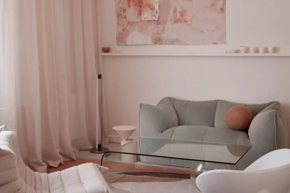
Stylist Nat Turnbull’s serene Melbourne stay, Hazel House. Artwork by Jahnne Pasco–White from STATION. Grapho Bubble Pendant by ISM. Curtains from Zepel. Le Bambole sofa by B&B Italia. ‘Laurel’ side table by De La Espada. Coolabah rug from TSAR. Tube Light by Eileen Gray from Anibou. Photo – Sean Fennessey.
In my work as an interior designer, it’s important to know what is happening in the broader design world and thankfully with social media, this has never been easier.
During Milan Design Week I swiped, scrolled and sifted through hundreds of images that came through my instagram feed.
Via social media, I got to see in real time the latest releases from the biggest furniture brands in the world, as well as brand new emerging designers. The Milan Furniture Fair consists of Salone del Mobile (like Jeff’s Shed only 100 times bigger!) and the design week satellite events that take place across the streets of Milan.
As I dived into all of the new designs shown in Milan, I began to see a few common threads — organic curves and pebble shapes being one trend to watch, amongst many! Here are some of the key shapes, colours and textures that made a big statement in Milan this year.
Furniture: This organic pebble shape is appearing as a key element in coffee tables, sofas and lighting. Where we once saw streamlined, clean, minimalist (dare I say sterile) shapes, we’re now seeing a more asymmetric, organic, curvy forms emerge. In a room, this shape introduces a contrast to the straight lines of the architecture. It recalls the free-form shapes seen in nature and gives a grounded, down-to-earth feeling.
Sofas referencing this organic, soft shape will instantly give a room a beautiful softness and feeling of comfort. Their soft lines beckon you to sink in and relax. A coffee table or side table is a great way to add this shape to a space, instantly breaking up the straight lines and giving a room a laid-back vibe. Layering handmade ceramics is less commitment than a statement furniture piece yet still impactful.
Colour: It’s been a while since greys and bright whites were seen at the Milan Furniture Fair. Thankfully, because warmer tones like putty, beige, tan and terracottas are really easy to live with — and we’re seeing them everywhere! These warm tonal hues are perfect neutrals that pair well with other colours, such as the burgundy and reddish tones that were also seen widely in Milan this year.
Texture: Where colour isn’t so strong, we call on shape and texture to do the heavy lifting. A room that is neutral tones of beige, tan and putty will look very dull and lifeless unless we dial up other elements. Include contrasting texture such as soft wool upholstery next to a sleek, glossy side table or an irregular handmade ceramic piece atop a flat, smooth sideboard.
This is all about creating contrast, which is visually exciting. Add in something metallic to lift the space and suddenly a room that isn’t focused on colour feels full of life and interesting.
Additional moodboard credits: (from left) Claire Ellis vase ‘Mining Companies Buy Political Influence in Australia, Report Says’ from Craft Victoria. Simone Karras Ceramic Raku Vessel, medium from Pepite. Classic Clumsy Boucle handmade cushion. Art by Caroline Walls. Bastard Ceramics Ceramic sculpture ‘Milestone’, from Pepite. Claire Ellis vase ‘NSW mining inquiry recommends public air quality monitoring’, from Craft Victoria.
