How An Old Block Of Flats Became A Serene Multi-Generational Family Home
Architecture
The Linton House by Sonelo Architects is a spectacular multi-generational family home in Melbourne.
The original double-storey duplex at the front of the home features a terracotta roof and stucco wall.
A new garage has been built on the basement beneath the house.
The existing interwar flair is carried into the house’s new iteration, starting with the geometric details above the front door.
The structure of original flats has been retained and rearranged inside.
A sculptural billowing retractable shade hangs above the new outdoor dining area.
Off-white render blends the new parts of the home into the existing building.
The addition features a charred-timber exterior with extensive glass doors and windows below.
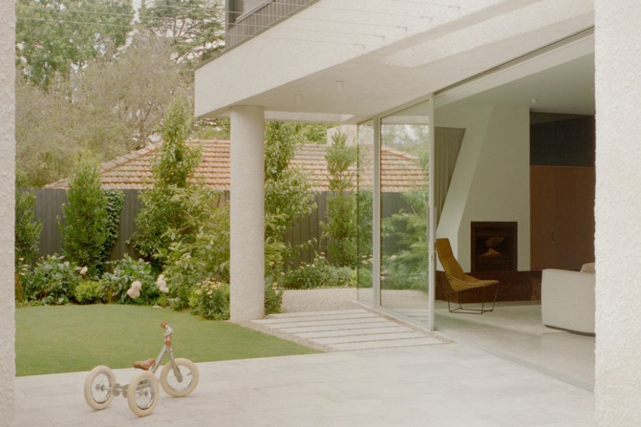
A key focus of the renovation was to embrace the house’s leafy surrounds.
Chair from AJAR. Coffee table from SBW Australia.
A calming palette of navy blue lines the joinery in the kitchen.
Side table from AJAR. Sculpture from Modern Times.
Dining chairs from Apato. Bar stools from SBW Australia.
A scalloped walnut-timber staircase leads to the three levels of the new addition. Basket from Pan After.
One of the existing bedrooms has been adapted into a library. Dining chair from Apato. Sculpture from Modern Times.
Elegant cornice details and doorways reveal the building’s heritage.
Japanese mosaic tiles are paired with subtle pops of colour in the bathrooms.
Inside the children’s playroom. Dining chair from Apato.
Curved details bring a modern edge to the interiors.
The formal living room. Side table from AJAR. Chair from SBW Australia. Vase from Modern Times.
The guest ensuite maximises space with a two-way mirror vanity, featuring both a shower and toilet.
When the owners of The Linton House first engaged Sonelo Architects in 2020, they were a family of three.
The young couple had just purchased an old block of flats in Melbourne’s leafy southeast and were looking to convert the interwar building into a multi-generational home that was a little bit unique. Fast-forward 24 months — through planning, permits, design, and construction — and they were a family of five by the time the transformative renovation was complete.
Safe to say it was a big undertaking. The block had a blanket heritage overlay, and the solid-brick flats were in great condition, but one of the biggest challenges was working with the siting and orientation of the flats.
‘The living areas received hardly any sun during the day,’ Sonelo director Wilson Tang says. ‘[The clients] also wanted space for visiting grandparents with flexibility for them to move in permanently at some stage in the future.’
Luckily, the building had ample space beneath its soaring ceilings to carve out room for everyone.
‘The flats were retained and mostly untouched,’ Wilson says.
Only the redundant rear balconies, the communal laundry, detached garage storage, connecting doorways and galley kitchens were removed to make way for the more streamlined floor plan. A new basement made way for a garage and entertaining room; the ground floor has been designed to function as an accessible guest wing whenever needed; and a beautiful scalloped walnut staircase leads to the three-level addition.
Neatly tucked away at the rear inside a timber volume, the considered extension manages not to overshadow its neighbours or detract from the elegant facade.
‘We want to celebrate the architectural style of the interwar period and our clients’ fondness of Japanese aesthetics,’ Wilson says. The original terracotta roof and stucco walls influenced the use of renders and cornice detailing throughout the house, while glazed mosaic tiles and timbers nod to Japanese design.
‘The main blue colour is referenced and adapted from the old blue grey render wall. Added to the mix is our interpretation of sky-blue and cherry blossoms, resulting in a medley of Dulux Hauraki Gulf, Dulux Mazzone, Dulux Casper White, and Dulux Hammer Grey throughout the house,’ he adds.
‘Internally, we wanted to create an interior that is neutral to frame the lush surrounding greens. At the same time, it is warm, earthy, and feels modern.’
The resulting palette is simple yet wonderfully elevated, with stone accents like granite and textures of black and walnut timber veneer.
The ground floor of the addition now houses the family’s light-filled living areas, with floor-to-ceiling glass doors that open to calming views of the garden and the outdoor dining area — set under a billowing retractable shade that makes the space enjoyable in rain, hail, or shine.
While the property has been given a completely new lease on life, the ‘LINTON’ sign on the home’s facade quietly pays homepage to its past.
