A Renovated Northcote Bungalow Where Nothing Is ‘Too Precious’
Homes
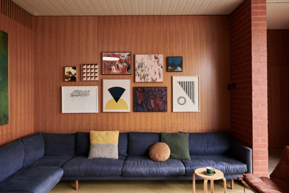
Artworks (clockwise from top left) by: Hannah Fox, Emma Lipscome, Hugo Fox, Susanne Waddell, Sean Meilak, Retro Active, Bec Smith and Charles Blackman. Nook sofa from Jardan. Stool from Ikea.
Nook sofa from Jardan. Stool from Ikea. Ingmar Relling Siesta chair from Nord.
Artist Hannah Fox inside her Northcote home.
Ingmar Relling Siesta chairs from Nord.
The living room has a view of the outdoor fireplace and Ruby’s kennel.
Ruby the dalmatian loves lying on the warm concrete floors. Ceiling painted Dulux White Cloak.
Crop Stools from Relm. Ceiling painted Dulux White Cloak. Outdoor Volley Lounger from Tait.
Art (clockwise from top left) by: Rita Green, Kelly Larkin and Hannah Fox. Sculpture by Lucas Wearne, Neighbourhood Studio. Walls painted Dulux Berkshire White.
Art (clockwise from top left) by: Mark Alsweiler, Bec Smith, Hannah Fox, Hannah Nowlan, Kevin Lincoln. Planet Lamp from Ebay. Akari 21A pendant. Rug from Ikea. Walls painted Dulux Berkshire White.
Futura Natura mobile by Flensted Mobiles. Stool from Ikea. Bed linen from In Bed.
Original painting by Harry Booström from Gallery Midlandia. Bed linen from In Bed.
Hannahs’ studio! Walls painted Dulux White Cloak.
Hannahs’ studio, featuring works from her latest exhibition ‘Perimeter’. Walls painted Dulux White Cloak.
The front garden was once concrete and weeds, with no fence. ‘I planted the garden myself with lots of trial and error over the years!,’ says Hannah. Front door painted Dulux Klavier. House exterior painted Dulux White Duck.
The hallway in the original part of the house, leading to the new extension. Akari 21A pendant. Walls painted Dulux Berkshire White.
Nothing in artist Hannah Fox and her husband David’s Northcote house is ‘too precious’. With three growing boys, Hugo (14), Isaac (12), Jude (10), and Ruby the dalmatian running around, there can’t be, Hannah says.
‘We want people to feel comfortable here… the door is always open for the boys to have their friends over. We spread out and lie on the carpet in front of the fire, entertain, congregate around the enormous kitchen bench, and the boys play footy and nerf gun wars in the corridor — much to my horror!’, she explains.
Filled with textural brick, blackbutt timber wall paneling, warm concrete floors and large sliding doors that open to the backyard, it’s relaxed, inviting and designed perfectly for their lifestyle.
But this wasn’t always the case. Back in 2010 when Hannah first strolled past the house pushing a then baby Hugo in a pram, it was in dire need of ‘TLC and some major elbow grease.’
‘It was a case of renovate or detonate’, she says.
Naturally, she called David straight away to announce she’d found ‘the one’.
Surrounded by concrete, with no fence and a garden of weeds, the old California bungalow’s only saving grace was its double front doors, brick verandah and extra wide hallway.
The young family moved in straight away, and completed a major renovation of the original part of the house. It took Hannah and David three years, working almost every weekend to pull up the carpet, restump the floors, rip down the crumbling plaster, build new stud walls, refurbish the interior doors and windows, replace rotten weatherboards, update the bathroom, replant the garden and fix the verandah — all by themselves.
‘Now that I think back, maybe we were mad!,’ says Hannah.
Five years later, they were ready for stage two; a new extension. The couple engaged architect Rob Kennon to helm the design and then once again took on the renovation themselves with David as the owner-builder.
The Fox’s lived in the house the entire time, their kitchen-on-wheels moving from room, to corridor, to room as walls were repositioned and rooms renovated.
‘The boys often mention their memories of the kitchen being in the corridor and the washing hanging in trees in the front garden to dry,’ says Hannah.
A year later, the red brick extension was finished and their corridor cooktop was no longer needed. In its place stands a large, functional kitchen, primed for entertaining.
Mid-century references appear throughout the space, including the way in which the extension is ‘zoned’.
‘We wanted to avoid the typical “open plan” living, dining, kitchen style,’ explains Hannah. ‘We love the way our home’s rooms are separated by a shift in floor level, ceiling height, change in floor materials or divided by the central fireplace.’
Every room has its own feel — separated, but brought together by the floor-to-ceiling windows that span the entire rear of the extension. It means the family can do what they do best; entertain, spend time together, play footy in the extra wide corridor, but also enjoy a bit of space.
