Inside An Architect’s Calming Mid-Century Queensland Pad
Architecture
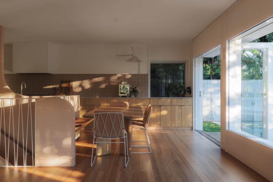
Large open doors and windows by Duce Timber looking out to the north-facing pool. Custom steel balustrade by Superior Weld.
Dining table and chairs from Jardan. Wall tiles by TopCer from Metro Tiles. Nemo Lamp De Marseille Mini wall light.
Terrazzo benchtop and splash in Artedomus ‘arterazzo rosaio’ cut, installed by Precision Stone Services.
Carmen added a pool, small deck and level lawn on the northern side of the house. The deck is uncovered, but the whole lounge opens up to give an indoor-outdoor feel.
Microcement sunken bath by Conquest Rendering. Duce Timber windows.
TopCer bathroom tiles from Metro Tiles. ABI Interiors taps.
Wardrobe doors from Ren Studio, hand-painted by Carmen’s dad. Hay bedside table. Cultiver linen.
A stairwell was added leading from the. living area to the old rumpus room space which now houses an office, TV room, guest bedroom and bathroom, with access to the garage.
Gorgeous sunlight enters every area of the home.
Custom steel entry balustrade by Superior Weld.
A classic 1970s facade.
Back in 2014, Brisbane architect Carmen Saide and her husband Rob found themselves disheartened after missing out on their dream home at an auction.
A few weeks later, determined to get over their disappointment, the couple attended an open home for a classic 1970s mid-century property heading under the hammer the next day.
‘When we inspected the house, we were pleasantly surprised by the generous room sizes, the ample light, the leafy outlook and privacy,’ Carmen says. ‘I was going out of town the next day but Rob decided to attend the auction just to see what the house would sell for.
‘He called me in the afternoon to tell me he had the highest bid and to ask if he should keep going! After having spent only five minutes in this house we owned it.’
As it was originally designed by a local engineer, the structure was solid and the home comfortable to live in, with many of its original ‘70s features remaining — from the sunken concrete bathtub tiled in pink and green Italian glass mosaics, to the moody ground-floor rumpus room where regular parties were said to have taken place over the years.
However it wasn’t all charming. The previous owners had removed the original kitchen and replaced it with a flat-pack kitchen and appliances that later broke down. They had also painted everything white, which began peeling after a few years.
Carmen and Rob had planned to renovate sooner, yet struggled to find the time after their son Eli was born. But eight years in, when the original waterproofing failed on the retaining walls and the grout became worn down from decades of scrubbing, they knew they couldn’t delay any longer.
You’d think having designed many homes throughout her career, the renovation process would come easily to Carmen. But she says the biggest challenge was actually knowing too much!
‘I knew every option for each part of the renovation and without an objective third party — the role I usually play — to help, I pained over every decision,’ she explains. ‘Not knowing every amazing possibility, or having someone else filter the options for you, would have made decision making easier both practically and emotionally.’
But she took her time, making each design choice carefully. Inspired by the mid-century houses found in California, as well as the home’s original orange brick exterior, Carmen and Rob focused on clean horizontal lines, ‘unfussy’ detailing and a minimal but warm, tonal palette.
To create a soft, calming atmosphere, they incorporated colours like dusty pinks and browns, soft whites and oak, contrasted with pops of colour from the rust velvet living room sofa and the terrazzo kitchen benchtop.
The original stairwell bathroom and toilet were converted into two separate bathrooms, one with the original sunken bath refinished in microcement as a nod to the ‘70s build.
They also removed the walls between the kitchen, laundry and living areas to create a large, open-plan space that opens up to a sunny north-facing deck overlooking the swimming pool added in the renovation.
Although they faced some challenges, Carmen says the house is now aesthetically, functionally and emotionally customised to her family.
‘Having my own lived experience of what I deliver for other people everyday has added a new layer to my appreciation of the power and value of good design,’ she adds. ‘What I am most proud of is the fact that people love being here.
‘We often hear ‘I just love it here; it feels so calm’ and it warms my heart. That is the essence of what we set out to achieve.’
