Inside A 1970s Gem, Redesigned Around Its Bold Front Door
Interiors
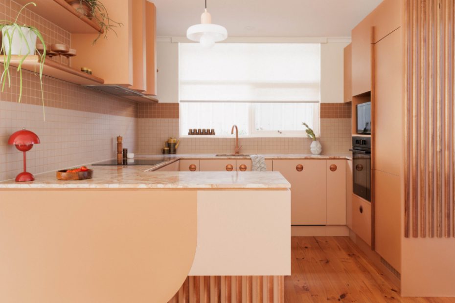
The playful kitchen fit-out.
CDK Fascino Marble on benchtops. Artedomus Sugie tiles on splashback. Joinery designed by Spacecraft. Melamine doors by Forest One. Walls painted Dulux Whisper White.
The range hood features a curved island panel that softens the otherwise rigid lines.
Booth seating enhances the home’s retro styling.
Bookshelf made from crown-cut blackwood veneer.
The living room. Feature wall painted Dulux Italian Clay. Noblett dining table, chairs and teak sideboard from Facebook Marketplace.
Noblett dining table and chairs from Facebook Marketplace.
Vintage Falcon Chair by Sigurd Ressell.
Momo cabinet handles by Sussex Taps. Perini floor tiles on walls.
Walls painted Dulux Stowe White.
Original terrazzo flooring. Laminex Pale Honey on cabinetry.
Cerbis tiles on splashback. Laminex Pale Honey on cabinetry.
Upper wall painted Dulux Whisper White. Lower wall painted Dulux Potters Pink.
Bedheads and robe made from Tasmanian oak veneer.
The new joinery replaced an old dark-stained colonial wardrobe that looked out of place.
A study nook.
The charming exterior.
They kept the old orange door, but just painted it a slightly more subtle hue.
The three-bedroom property has been completely transformed.
The 1970s was an era defined by bold colours and textural materials — which explains why this McLaren Flat house in South Australia radiates retro energy before you even step foot inside.
Spacecraft Joinery directors Nathan and Ellen Wundersitz fell in love with the home’s bright orange door and stone-clad facade right away. They were especially drawn to the floor-to-ceiling windows, which captured the golden afternoon light in the most glorious way.
However inside, there was barely a trace of this home’s original flair. ‘The kitchen had been replaced with a ’90s white melamine cheap kitchen that was functional, but added nothing aesthetically’ Ellen says.
As joinery designers, Ellen and Nathan knew that both the kitchen and the bedroom would be their focal point for the renovation, providing an opportunity for them to flex their design skills with new cabinetry to elevate these spaces.
Before even settling on the property, Ellen and Nathan also spent a few months scouting op-shops, garage sales, and Facebook Marketplace for the perfect vintage pieces, which they stored in their family home until they got the keys in January 2023.
‘The warm earth-inspired colour palette of the items as a collective was overwhelmingly dirty browns, mustards, terracotta, dusty pinks, ochre, and burgundy,’ Ellen adds. This — in conjunction with the bright front door — helped set the tone for the rest of the redesign.
The compact floor plan was retained and revived through new carpets, fresh paint, window furnishings, and of course, joinery. They replaced the white kitchen with patterned marble benchtops and cost-effective melamine joinery in apricot and peach hues, alongside a playful splashback of contrasting tiles.
A new booth seat carves out a cosy casual dining area reminiscent of an old-school diner, encased by a clever in-built shelving unit.
Timber help bring a sense of character back into the tired interiors, with Nathan designing custom beds with built-in side tables and a functional open wardrobe for the cosy main bedroom. Now, every detail, trinket, and artwork serves as a meaningful nod to the home’s history.
It’s been a happy holiday home for the Nathan, Ellen, and their two kids, and the family have plans to move to the region permanently in their twilight years. But for now, they’ve listed the home for stays on Airbnb!
