A ‘Jewellery Box’ Transformation Of A 1970s Studio Apartment
Architecture
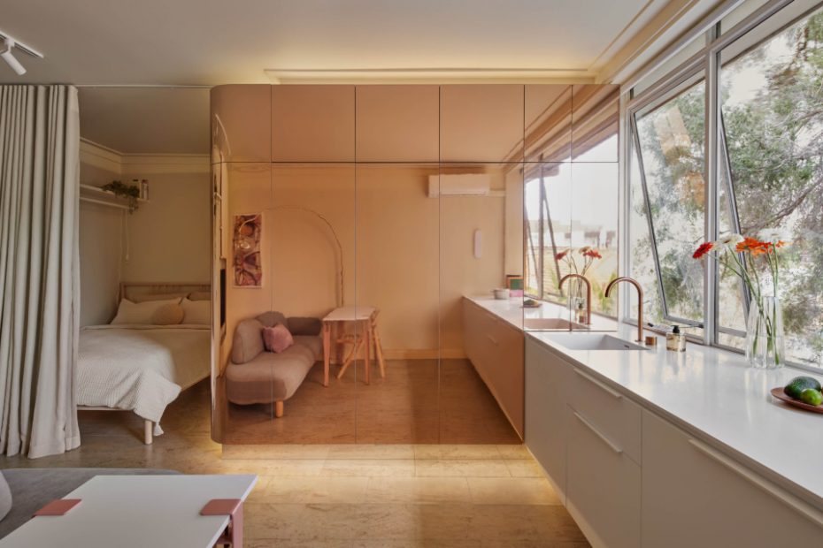
A statement ‘pod’ clad in copper, mirrored, metal laminate has transformed the look and function of this tiny 1970s studio apartment.
The statement pod conceals the bathroom behind integrated joinery.
The kitchen has been reoriented to face the window, creating the illusion of large space.
Additional storage is sleekly integrated into joinery surrounding the mounted television.
A foldout desk in the pod joinery.
A clothes rail for hanging items is hidden from the communal spaces behind the bedroom curtain.
Surprises unfold as one ventures into the home, revealing pops of terracotta in the bathroom interiors.
The new bathroom door is away from the apartment entrance.
The 1970s brick building facade.
When the current owners first took possession of this St Kilda apartment, the home was a bare bones studio in a simple 1970s brick building.
The 27-square-metre floor plan lacked separation between spaces — particularly from the awkwardly positioned bathroom visible immediately on entry.
Tsai Design designed the renovation of the apartment to serve as both the owners’ part time home and short-term accommodation.
‘They reside in Europe but need to make regular trips to Australia for work and family, so they decided to purchase the apartment as a permanent base for when they visit Australia, but also to have it as a rental unit when they are away,’ explains Jack Chen, director of Tsai Design.
Repositioning the bathroom door was key to the apartment’s transformation. Tsai moved this from the centre of the apartment to the edge — away from direct view on entry — and clad the room in mirrored laminate joinery to create a feature ‘pod.’
‘This started as a simple mirror laminate. It was actually the client themselves who suggested having it in a copper mirror finish to create a bit of drama and be easily Instagramable for social media promotion of the short-term rental,’ says Jack.
‘We tend to use mirror as a material quite a lot for small spaces, as it helps to distort the perception of the size of the space.’
The pod cladding — executed by JG Interiors — is also exceptionally functional, featuring one side that doubles as a foldout desk, and pantry storage on the kitchen side.
Additional storage is sleekly integrated into joinery surrounding the mounted television.
The bathroom borrows space from the kitchen, which has been reoriented to face the window, again creating the illusion of large space.
‘They did not need a full kitchen setup, as they are not big cooks and would rather eat out,’ explains Jack.
While still technically a studio, the apartment’s bedroom is now defined by a floor-to-ceiling blackout curtain that provides complete darkness as required by the owners and jet-lagged Airbnb guests.
Jack likens the renovated apartment to the ‘one big jewellery box.’
‘Everything is kind of connect to each other,’ he says.
Surprises unfold as one ventures into the home, revealing pops of terracotta in the bathroom interiors, and blue and yellow accents when the copper clad pod panels are opened.
The 27-square-metre studio now hosts all the features one expects of a traditional home, and looks good while doing it.
