A Joyful, Cheeky Interior For A Cape Paterson Townhouse
Interiors
The entry way with features a curved wall of vertical timber cladding and with shelving finished in pastel pink Laminex.
Carolyn Burns-McCrave of Burns McCrave Design.
The study/third bedroom features a hot pink sofa and integrated fold-down sofa behind.
The Murphy bed folds out as desired.
The power room features tiled benchtops, arched mirror cabinetry, and matte white tapware.
Laminex overhead joinery in the study.
The main bathroom.
Pastel pink wall tiles and patterned floor tiles meet in the bathroom.
Tiled benchtops continue in the laundry.
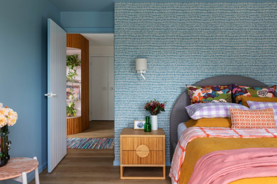
Dulux Sky Eyes paint colour in the main bedroom.
Blue creates a restful, cocoon-like space, no matter the season.
The main en suite featuring matte white tapware and Kado Neue Arch Mirrored Shaving Cabinets from Reece.
The main en suite was moved to appreciate pool views.
Carolyn Burns-McCrave of Burns McCrave Design says the vision for this townhouse renovation was ‘joy.’
‘Pure and simple. I wanted my clients to smile every time they walked in the door,’ she says.
The townhouse in question was a two-storey holiday home in Cape Paterson, located in Victoria’s South Gippsland region. The house needed both a functional redesign of the ground floor, and a cohesive interior makeover.
Carolyn explains, ‘There was no direct physical connection to the plunge pool and deck in the front yard, and tones of cream, terracotta, and white made the space feel drab and uninspiring.
‘As a result, my clients would spend all of their leisure time on the top level, leaving the ground floor as an underutilised, utilitarian space.’
Carolyn reconfigured the ground floor plan to remove wasted space. A seldom-used rumpus room downstairs was divided to introduce a new third bedroom, behind an oversized sliding cavity door. This room now features direct access to the home’s courtyard, and bespoke joinery that integrates a queen-size Murphy bed and sofa.
The bedrooms and bathrooms were also given a major facelift, featuring tiled bench tops, arched mirror cabinetry, matte white tapware, and blue terrazzo tiles.
Abundant new storage to hide holiday clutter was installed throughout, including a curved wall of vertical timber cladding hiding two secret doors for dedicated wine storage, and an under stairs storage room.
Carolyn designed the look of the interiors to be ‘welcoming, relaxed, even a little bit cheeky.’
Covid lockdowns gave her clients more courage to experiment with colour, leading them to a palette of 1980s-inspired hues — from a calming blue (Dulux Sky Eyes) in the bedrooms that inspires a cocoon-like space, to a feminine pastel pink (Dulux Slubbed Silk) in the bathroom.
‘In the scheme of things, making some bold choices with tiles, wallpaper, and paint colours didn’t compare with a global crisis, and as such gave us freedom to strive for a positive and delightful sanctuary,’ she explains.
‘We used Laminex for the custom joinery to keep the budget in check, and complemented the primary bedroom and study schemes with patterned wallpaper to bring some visual energy and movement.’
Carolyn’s tip when introducing colour at home is to look at existing pieces you love for inspiration. ‘Look at your wardrobe. Think about the colours you feel confident wearing. Look for colour combinations in your favourite artworks and use those as jumping off points.’
In the end, what Carolyn is most proud of here, is curating what she describes as ‘the most ‘elusive quality in any project’: the vibe.
‘This is such a joyful house that really flows, providing generous spaces that feel welcoming and warm,’ she says.
‘The whole process was a delight from start to finish. So much so that we are nearing the end of doing it all again with a new city residence!’
