Set The Mood With Luxurious Colour Drenching, Here’s How
Interiors
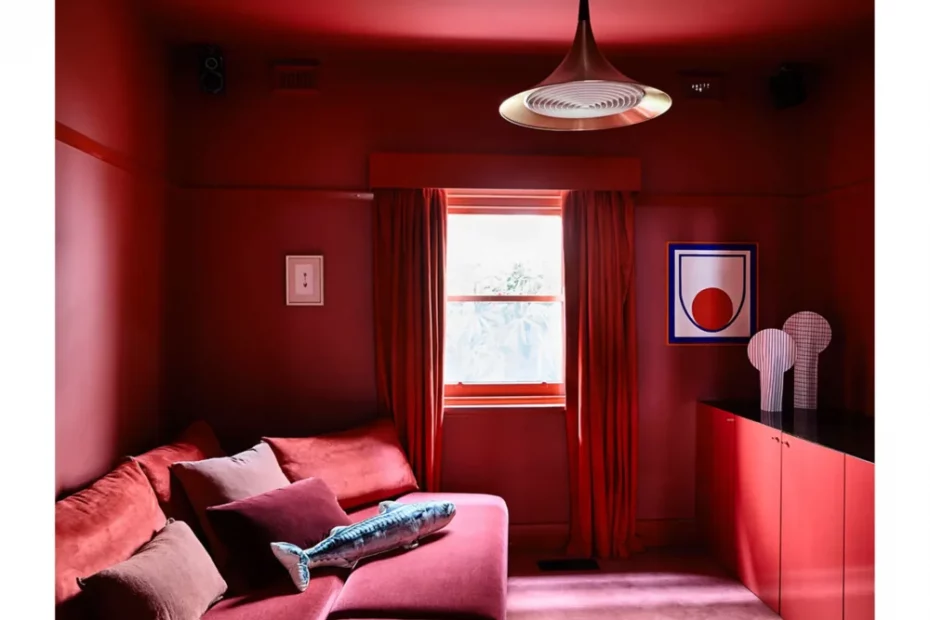
Take your paint colour from the floor to the ceiling! Design – Studio Doherty. Photo – Derek Swalwell
Add in warm timber details for contrast. Studio Elroy by LINTEL. Photo – Luc Rémond. Editorial Styling – Benjamin Clay.
Arch and inside arch: Dulux Auburn Flair. Walls, trim and ceiling: Dulux Plum Sauce. Rug by Designer Rugs. Sofa and matching cushion by Arthur G. Patterned cushion from Top3 By Design. Moss cushion by Linen House. Lamp from Angelucci 20th Century. Coffee table by Fanuli. Purple vase by Jardan; Green vase by Design Stuff. Red side table from Cult. Floral Study on Stripes by Ali Mcnabney-Stevens, from Studio Gallery. Photo – Lisa Cohen. Styling – Bree Leech.
Ceiling painted: Dulux Whisper White. Rail and posts: Dulux Red Clown. Walls and around window: Dulux Grapeshot. Bench by Beeline Design. Photo – Lisa Cohen. Styling – Bree Leech.
Parkville House by Placement. Photo – Tom Ross. Styling – Jess Kneebone. Construction – Original Projects
In Gloss House by Studio Doherty and Enth Degree Architects, green tiles transform the space into a verdant retreat. Photo – Anson Smart. Styling – Sarah Weston.
Gloss House by Studio Doherty and Enth Degree Architects. Photo – Anson Smart. Styling – Sarah Weston.
In Hamilton House by Lauren Egan, dark blues create a luxurious and restful space. Photo – Glenn Hester
It was Kelly Wearstler who threw me headfirst into the world of colour-drenching with her Farrow & Ball collab. I stumbled upon this almost six years ago, and it felt like tumbling down the most delicious rabbit hole.
Colour drenching is the practice of immersing a space in a singular hue, and calling upon a symphony of shades, tints and tones to create a deeply layered, immersive experience. Whether bold and brazen or soft and serene, the art lies in the balance.
True colour drenching isn’t about creating a flat box of colour, it requires building depth through the careful layering of materials, textures, finishes, and tonal shifts that make a space feel rich, tactile, and wonderfully delectable.
Here are a few ways to approach colour drenching to get the balance just right:
Set the mood:
The mood, or the intention, of the space should always guide the colour you choose to immerse it in.
If you’re seeking softness and calm then muted, muddy tones are your friends. Studies even show that saturating a space in a single gentle hue can ease stress and foster a deeper sense of peace.
For those chasing boldness and impact, look to the jewel tones. Rich, saturated colours have a natural cocooning effect, wrapping the space, and everyone in it, in depth and drama.
In my experience, colours borrowed from nature always create the most soulful, grounded interiors. Earthy greens, warm ochre and clay-like terracottas, these are the hues that invite you in and make you want to stay a little longer.
How much colour?
Once you’ve landed on your colour, let it become your north point, the guiding star for everything that follows.
Working within a spectrum of shades, tones and tints from your chosen hue will build a visual rhythm through the space, creating an immersive repetition that feels both considered and effortless.
How far you take the drenching is entirely up to you. It might be a singular moment, like the red staircase in Brahman Perera’s Henne Fiveways, where one zone is saturated in colour. Or it might be a full immersion, ceiling, walls, floors, and furniture like the bold St-Kilda Residence by Studio Doherty.
Personally, I favour an approach more in line with Simone Haag’s Weeroona House, where colour plays a gentle supporting role. It acts as a backdrop for furnishings, art and lighting that sit within the same tonal family, without competing for attention.
If you’re really feeling it, you can also ‘double-drench’. Choose an unexpected colour to throw a little twist into the space. This colour can be of a brighter hue or a contrasting colour to dial up the impact!
One last thing to consider is light. Rooms bathed in natural light can carry deeper shades and cooler tones with grace, while spaces with less natural light often feel more inviting when dressed in warmer, lighter hues.
Embrace layers:
There are so many ways to layer texture into a space, depending on your budget and your appetite for detail. The balance lies in introducing a symphony of tints, shades and tones to build depth.
Ideally, we’d all be living out our Venetian plaster dreams, finished with a gloss beeswax sheen. But, alas, reality (and budgets) often calls for creative alternatives.
One beautiful way to soften and texture your walls is with limewash, creating that subtle, cloud-like buffering effect. Texture can also be introduced through tonal wallpaper, like a grasscloth, or timber mouldings painted in the same hue as the walls. But it doesn’t stop there, applying paint in different finishes can also play a powerful role, combining matte and gloss across different details to build depth.
From there, it’s all about layering with curated materials. Combine a high-loop textured rug underfoot with velvet and boucle upholstery, and finish with linen curtains that catch the light. Don’t forget to include touches of timber and a scattering of metals.
Kennedy Nolan’s Melbourne Place project is a masterclass in this: brickwork, carpet, and sculptural furniture layered together to create a guest lounge that feels utterly immersive and sumptuous.
Reap the benefits!
Colour-drenching can completely shift your perception of space. Small rooms feel larger, while expansive rooms are wrapped in a sense of intimacy. By removing sharp contrasts, the eye no longer fixates on edges and boundaries, it blurs the lines we instinctively associate with a room’s size and shape.
When you drench both ceilings and walls, corners soften, edges dissolve, and you create an atmospheric backdrop that lets furniture, art, and objects truly sing. The space feels curated, not chaotic.
A few tricks to keep up your sleeve:
– Paint built-in robes the same colour as the walls to create a seamless blending effect and visually enlarge the room.
– Use colour to blur out awkward junctions or architectural details you’d rather not highlight.
Colour choices can feel overwhelming, but remember: you’re not married to the paint. You can always repaint, refresh, and evolve.
Focus first on getting the foundations right, the intention, the feeling, before you fall too far down the rabbit hole. But most importantly, choose what makes you happy. That instinct is never wrong.
Additional moodboard credits (from left): ‘Ceramic Sculpture’ by Anna Parsons from pepite. Snake Valley Cushion In Chocolate from Fenton & Fenton. Zulta Cushion In Spice Road from Fenton & Fenton. ‘Nude’ by Julia Trybala from Station Gallery. ‘Looking At Me Looking At You’ Mirror by Jordan Fleming ‘Spike Catchall’ Dish, in Red by Theodosius Ng from Craft Victoria. ‘Destiny’ by James Lemon from Craft Victoria.
Want to see more? Visit The Design Directory to discover our top picks in flooring, furniture, lighting, tiles, tapware and more!