How To Mix Timbers In Your Home Like A Pro
Interiors
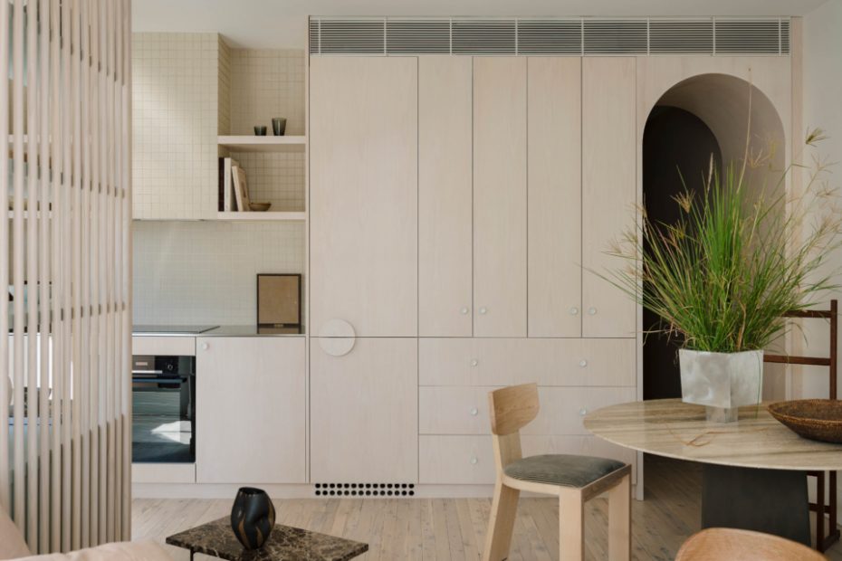
Whitewashed timber floors and plywood cabinetry sit harmoniously together in this Sydney apartment. ‘Yin Open’ vessel (on side table) by Yen Qin from Craft Victoria. ‘Painting Concerning Skin’ artwork by Morgan Stokes from Curatorial and Co. Remnant Side Table by Marlo Lyda from Spence & Lyda. Bowl (on table) from Orient House. IXIA Vase by Hattie Molloy. Design – Together Design Studio. Styling – Jack Milenkovic. Photo – Clinton Weaver
Original warm red-toned floorboards mix with equally warm timber veneer cabinetry in this kitchen. ND109 Table by Nanna Ditzel and DC11 Walnut Oak Chair from Great Dane Furniture. On table: AUDO CPH Taper Bowl from Design Stuff. Ceramic vase by Jade Thorsen. Ceramic Vessel (on shelf) and plinth by Emily Ellis from Pepite. Ceramic Sculpture by Stephanie Phillips from Pepite. In Common With Augustus Pendant from In Good Company. Design – Alexi Robinson Studio. Styling – Jess Kneebone
The original timber floors have been re-stained a chocolate brown. Design – Folk Studio. Photo – Jacqui Turk
The new kitchen in this 70s home features and island benchtop in Laminex Burnt Ochre, kitchen cupboards in Laminex White and spotted gum veneer joinery. Design – Fowler and Ward. Photo – Martina Gemmola.
Light herringbone floors meet darker kitchen cabinets in this art deco-inspired home. Design – Parker Studio. Photo – Jacqui Turk. Styling – Kerrie-Ann Jones.
Lighter timber dining chairs create subtle contrast with the warm timber floorboards and new cantilevered shelving. Design – Five Foot One Design. Photo – Jacqui Turk. Styling – Kerrie-Ann Jones.
Design – Five Foot One Design. Photo – Jacqui Turk. Styling – Kerrie-Ann Jones.
Joinery by 500 Workshop create contrast in colour with the bar stools by Martin Johnston Furniture, yet both sport the same texture, for cohesion. Design – Studio Isaza. Photo – Natalie McComas.
Design – Studio Isaza. Photo – Natalie McComas.
Home of Alyssa Owens. Landscape painting by Zak Tilley, commissioned in collaboration with art consultant Iona Litchfield. Table custom built by Assembly Bespoke. Pair of portraits by Mark Chu. Tissé Chairs in Stripe from Wore Store. Model 2065 Pendant designed by Gino Sarfatti for Astep from Mobilia. Clay vase and woven sculpture by Rrres. Vase on counter by Hilary Green. Shelf ceramics from Pepite. Rug by Hali Rugs.
Spotted gum joinery. Design – Fraser Mudge Architects. Photo – Tom Ross.
Terrazzo on benchtop from Artedomus. Artwork by Ella Dunn from Sophie Gannon Gallery. Ceramic on bench by Peta Marie. Egyptian limestone tiles from RMS Natural Stone. Cabinetry in American walnut by Guy Phelan. Appliances by Fisher & Paykel. Design – Adriana Hanna. Photo – Sean Fennessy.
Rice Paper Shade Large pendant by HAY. Dining table by Mark Tuckey. Mastro Chairs by Afra and Tobia Scarpa from Castorina. Candle holders by Fabien Cappello. Design – Victoria Merrett Architects. Photo – Tasha Tylee. Styling – Tatjana Melchiorre
Design – Victoria Merrett Architects. Photo – Tasha Tylee. Styling – Tatjana Melchiorre
In Wallabies Watch mismatching timber dining chairs, table and floorboards create a welcoming, warm space. Design – Studio MODA. Photo – Still Studio
When I work with clients, one of their biggest struggles is finding the right pieces that ‘match’ the same timber types.
It feels good when things match — it makes sense and it’s an easy formula to follow. Don’t get me wrong, when a space is filled with timber of the same type, it is absolutely gorgeous. However, sometimes it can feel flat and monotonous — it’s like a showroom, and a little too contrived.
That’s why it’s a good idea to mix things up a bit, and make your home feel more like ‘you.’
We have seen a move towards timber in our homes again. Where once everything was indiscriminately met with a white paint brush (please stop!), we are now finding that living with timber makes our homes feel softer, warmer, and more effortless. (White is unforgiving however timber can hide scuffs.)
I actually found a study that supported positive effects of natural wooden materials on our mood in the office environment. We’ve always had a hunch, but this is actually backed up by science. It’s true: wood in our spaces just makes us feel good.
Mixing timber tones is about balance, achieved through contrast. Too much of the same timber feels overwhelming so the key is to break it up with an intentional juxtaposition. There are always exceptions to the rule, however here are a few guidelines…
Texture
Timber can be different if the finishes are speaking the same language.
For example, if you’re matching chairs with a dining table, mix the tones of the timber (dark and light) but make sure the texture is the same. If the table has a matt finish, then the chairs should also have a matt finish, not shiny and polished.
Texture creates cohesion even when colour varies.
Contrast
The goal is not ‘almost matching’. The goal is clearly deliberate mis-matching .
First decide on what the main timber element will be, usually it is the floor. American oak floorboards are an easy colour to live with on the floor (not too light or dark). Pair it with walnut kitchen cabinetry for a strong contrast that works. They are not supposed to ‘match’, rather the darker tone of the walnut adds depth.
Pattern
Mixing too many ‘busy’ timbers can look too chaotic. On the other hand, if the timbers are too ‘quiet’ it can look too flat.
A feature timber can really lift a space and add interest. Consider feature pieces (adding one at a time) such as a burl side table, a spotted pine dining table or even the worn patina of a vintage sideboard.
Set against a smooth oak floor these feature pieces really sing. Let one be the star. The others can hum politely in the background.
Colour
Mix timbers in the same family.
Cooler, paler timbers (bleached finishes, American oak, pine) tend to play well together, while warmer, redder timbers (jarrah, walnut) like each other’s company too.
Mid-tones like Tassie oak which, fun fact, isn’t actually oak at all, are brilliant bridge-builders. They can comfortably sit between light and dark, warm and cool, without causing drama.
Mixing timber tones isn’t about rules — it’s about balance, contrast and confidence. When it’s done intentionally, it adds depth, warmth, and personality. And that’s the whole point.
Because, your home shouldn’t look like everything was bought in one go — it should look like you.