Every serious travel photographer knows this feeling. You finally reach the spot. You’ve seen it a hundred times on Instagram. And then you raise your camera — and feel nothing. The best travel photos don’t happen at the designated viewpoint. They never did. They happen in the alley behind it, the hour before the buses arrive, or on the street that no guidebook ever mentioned. I wrote this article to tell you why that gap exists, what causes it, and how to work it to your advantage.
Why Do Crowded Tourist Spots Kill Your Best Travel Photos?
The short answer is visual fatigue. When thousands of photographers shoot the same frame, the image stops being yours. It becomes a copy of a copy. Furthermore, the crowd itself reshapes the scene. Selfie sticks, tour groups, and safety barriers physically alter what’s in front of you. You’re no longer photographing a place. Instead, you’re photographing the tourism infrastructure built around it.
I call this the Crowd Compression Effect. It describes how mass tourist presence compresses the visual field into a single, pre-approved angle. The Eiffel Tower at the Trocadéro. Machu Picchu from the Sun Gate. Santorini’s blue domes at sunset. These are images the world has decided are correct. And because they’re correct, they’re creatively dead.
The best travel photos require space — not just physical space, but interpretive space. You need room to see something differently. Crowds eliminate that room entirely.
The Photographic Dead Zone
There’s a specific phenomenon that happens at major landmarks. I call it the Photographic Dead Zone — the radius around a famous site where every image has already been taken. Within this zone, originality flatlines. Consequently, even technically perfect shots feel hollow. They rank well on stock sites. Yet they never move anyone.
The Dead Zone isn’t always large. Sometimes it’s just fifty meters. Sometimes, however, it extends to the entire neighborhood. You have to train yourself to feel where it ends. That boundary is where photography starts again.
The Friction Index: Why Harder Access Produces Better Images
Here’s a framework I’ve developed after years of studying travel photography: the Friction Index. It measures the relationship between the difficulty of reaching a location and the photographic reward it yields. The higher the friction — rough roads, language barriers, no tourist infrastructure — the lower the competition and the higher the visual dividend.
This isn’t just theory. It’s observable in the work of photographers like Sebastião Salgado, whose images from remote regions carry weight that no postcard destination ever matches. Similarly, Steve McCurry’s most iconic shots came from situations with maximum friction. You don’t get the Afghan Girl by booking a tour package.
The Friction Index predicts one thing reliably: wherever access is easy, images are weak. This holds across every genre of travel photography.
What High-Friction Locations Actually Give You
First, they give you time. Nobody is rushing you. There’s no tour group waiting for their turn. As a result, you can sit with a scene, watch how light moves, and wait for the moment that actually matters. Second, high-friction locations give you locals who haven’t been photographed a thousand times. Their reaction to a camera is genuine. That authenticity shows in the final image — always.
Third, and most importantly, they give you the feeling that you discovered something. That feeling transfers directly to the viewer. People can sense when a photo was taken by someone who was really there versus someone who was just passing through.
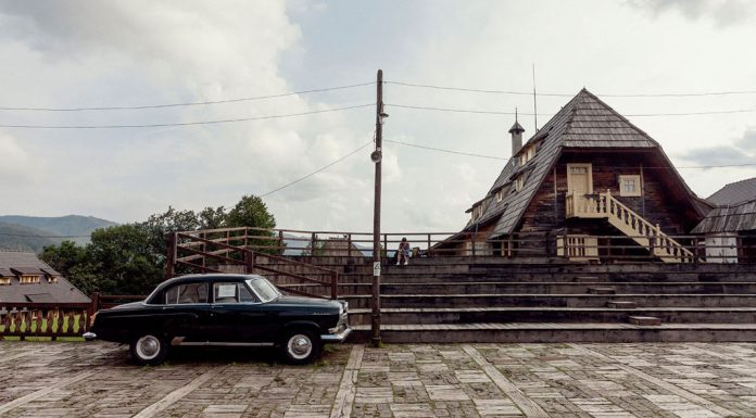
A shot from a road trip through Europe by iN Fravez Photography.
Peripheral Photography: The Discipline of Shooting the Margin
Most travel photographers make one fatal mistake. They shoot the subject, not the context. They photograph the monument but ignore the woman selling oranges beside it. They photograph the beach but miss the fisherman untangling nets in the predawn dark. I call this discipline Peripheral Photography — the deliberate practice of placing your lens at the edge of the obvious scene.
Peripheral Photography works because it captures what crowds ignore. Moreover, it produces images with far more narrative depth. A photo of the Colosseum tells you Rome exists. A photo of a man eating lunch in its shadow tells you Rome lives.
How to Train Your Peripheral Eye
Start with a simple rule. Every time you feel the urge to raise your camera, resist it for sixty seconds. Instead, look left. Look right. Look behind you. Ask yourself what the scene would look like from ground level, or from across the street, or ten minutes before it starts. This practice breaks the instinct to photograph what you’ve already seen online. Gradually, it rewires how you read a location visually.
Furthermore, try arriving at a location with your camera bag closed. Spend the first fifteen minutes just watching. Notice what moves, what stays still, where the light actually falls. Only then decide what you’re really there to photograph. The best travel photos almost always begin with this kind of patient attention.
The Authenticity Threshold: Distance from the Crowd as Creative Strategy
There’s a minimum distance from any tourist cluster that I call the Authenticity Threshold. Cross it, and the visual world around you shifts immediately. The rehearsed smiles disappear. The performative behavior stops. People go back to being themselves, and the city goes back to being a city rather than a stage set.
This threshold varies dramatically by location. In some places — central Paris, midtown Manhattan — it can be as little as two streets away. In others, you might need to leave the city entirely. But in every case, the moment you cross it, you feel it. The air changes. The image possibilities multiply. And suddenly, your camera feels worth picking up again.
Practical Ways to Find the Threshold
Walk away from the tourist cluster in the direction locals move. Not where the restaurants with English menus are, but where the laundromats and hardware stores are. Look for places where the signage stops being bilingual. Listen for the moment when you stop hearing your own language. These are reliable signals that you’ve crossed the Authenticity Threshold and entered territory where the best travel photos wait.
Also, use Google Maps in satellite view before you travel. Zoom out from the famous landmark and identify the dense residential grid nearby. That’s where you want to be. Tourist districts are almost always surrounded by genuine urban fabric. You just have to be willing to walk into it.
Images from “Where the World Begins”, a photography exhibition by Michele Palazzo, which was on display in the Still gallery in Milan, Italy.
Dead Angle Theory: Reframing the Famous
Not every photographer can — or wants to — leave the tourist trail entirely. So here’s a complementary strategy: Dead Angle Theory. Every famous site has angles that photography has collectively abandoned. They exist because they’re awkward, unflattering, or simply too far from the designated shooting area. These dead angles are gold.
The dead angle of the Parthenon is the side view from the street below — dusty, raw, architecturally honest. The dead angle of the Taj Mahal is the service entrance on the eastern perimeter. The dead angle of Times Square is the view from a second-floor fire escape looking down at the street-level chaos rather than up at the neon. None of these are famous. All of them are more interesting than the standard shot.
Why Dead Angles Work Visually
They work because they introduce friction into perception. The viewer has to reorient. They recognize the place but not the image. That gap — between recognition and surprise — is where emotional response lives. The best travel photos always create that gap. They show you something familiar in a way that makes it feel new.
Dead angles also tend to have better light. The official viewpoints are designed for midday orientation and compass directions that make logistical sense. Meanwhile, dead angles often catch side light, shadow play, or the geometry that trained photographers instinctively respond to.
Timing as the Final Variable
All of these strategies — Peripheral Photography, the Friction Index, the Authenticity Threshold, Dead Angle Theory — work even better when combined with aggressive timing. The best travel photos are almost never taken during peak tourist hours. They’re taken at blue hour, just after sunset, when the day-trippers are back on their coaches. They’re taken at dawn, when the city belongs to the people who actually live in it. They’re taken in rain, in fog, in shoulder seasons when the light is complicated, and the crowds have stayed home.
Timing is the variable that requires the least money and the most discipline. Anyone can get up at 5 AM. Very few actually do. That gap is your competitive advantage as a travel photographer.
The Blue Hour Premium
Blue hour — the twenty to forty minutes after sunset — is consistently underused by amateur travel photographers and consistently exploited by professionals. During this window, ambient light and artificial light achieve a natural balance. Colors intensify. Reflections deepen. And the crowds are almost always gone. If you shoot the best travel photos of your career at a famous location, the odds are high that you shot them during this window.
Plan blue hour before every location. Know the exact sunset time. Arrive thirty minutes early to set up. Then stay for the full window. This single habit will transform your travel photography output faster than any gear upgrade.
What This Means for the Future of Travel Photography
The rise of AI-generated imagery and the ongoing saturation of social media make the crowd problem worse every year. Therefore, photographers who continue to cluster at tourist hotspots will produce images that look increasingly indistinguishable from AI outputs — technically adequate, emotionally empty, and algorithmically optimized for nothing in particular.
The photographers who thrive will be those who move toward friction, toward margins, toward the authentic life that exists just beyond the frame the tourism industry built for you. The best travel photos of the next decade won’t come from the spots that get ten thousand visitors a day. They’ll come from the places that get ten.
The camera hasn’t changed. The light hasn’t changed. What changes is the willingness to go where the story actually is.
Frequently Asked Questions
Why are the best travel photos rarely taken at famous tourist spots?
Famous tourist spots suffer from the Crowd Compression Effect — mass visitation collapses visual variety into a single, pre-approved angle. Consequently, images from these locations tend to be technically competent but creatively inert. The best travel photos require interpretive space that crowds eliminate.
What is the Friction Index in travel photography?
The Friction Index is a framework that measures the relationship between the difficulty of reaching a location and the photographic reward it yields. Locations with higher access friction — remote terrain, language barriers, no tourist infrastructure — tend to produce more original, emotionally resonant images.
What does the Authenticity Threshold mean?
The Authenticity Threshold is the minimum distance from any tourist cluster at which genuine local life resumes. Cross it, and the performative behavior associated with tourism disappears. Your subjects act naturally, and the visual environment becomes significantly more photogenic.
What is Peripheral Photography?
Peripheral Photography is the practice of placing your lens at the edge of the obvious scene rather than on the primary subject. It captures the context, the marginal activity, and the human life that surrounds a landmark — producing images with far more narrative depth than standard tourist shots.
How does timing affect travel photography quality?
Timing is one of the most powerful variables in travel photography. Blue hour, predawn, and off-season periods consistently produce better light, fewer crowds, and more authentic scenes. The best travel photos are disproportionately taken outside peak tourist hours — not because the location changes, but because the crowd does.
What is Dead Angle Theory?
Dead Angle Theory holds that every famous site has photographic angles that collective photography has abandoned — because they’re awkward, unconventional, or outside the designated shooting area. These ignored perspectives tend to produce more visually interesting, emotionally surprising images than the canonical view.
Can you get great travel photos at popular destinations?
Yes — but only by applying strategies like Dead Angle Theory, aggressive timing, and Peripheral Photography. The location doesn’t automatically disqualify you. However, the standard approach to shooting famous places almost always produces weak results. Success at popular destinations requires deliberate deviation from what everyone else is doing.
How do I find locations beyond the tourist trail?
Use satellite imagery to identify the residential grid surrounding tourist districts. Walk in the direction locals move — toward functional, everyday infrastructure rather than restaurants and souvenir shops. Watch for the moment when signage stops being bilingual and your own language disappears from conversations around you. That’s where the best travel photography happens.
Browse WE AND THE COLOR’s Photography section for more inspiring imagery.
The post Why the Best Travel Photos Are Never Taken Where the Crowds Are appeared first on WE AND THE COLOR.