A Tactful + Light Sydney Cottage Transformation
Architecture
Lintel Studio has freed up this Leichhardt terrace’s ground floor to do less, better. ‘Parking spot with a view’ by Janis Clarke (2022).
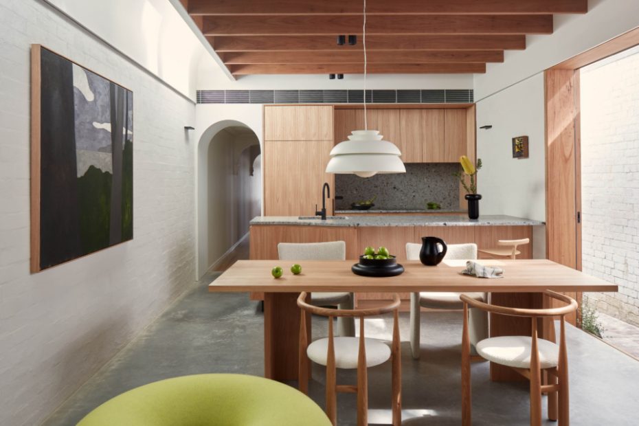
The ground floor now hosts the newly-united kitchen, living, and dining area.
Living spaces are flanked by generous openings to the backyard and a side passage. ‘Blue fence’ by Janis Clarke (2022).
Cavity sliding doors open seamlessly to the outdoor spaces, creating direct access to leafy planting, daylight, and ventilation as desired. ‘Blue fence’ by Janis Clarke (2022).
Carefully placed openings introduce an abundance of natural light without exposing the interior to the baking sun. ‘Blue fence’ by Janis Clarke (2022).
Concealed operable skylights — a feature that references the residential work of Mexican architect Luis Barragán — further enable the owners to alter their indoor climate.
The new upper storey is cleverly concealed from the street. ‘Bus stop blues’ by Janis Clarke (2023)
The upper extension creates tactful space for the new main bedroom and en suite.
‘Masculine/Kraft’ sculpture by Mika Utzon Popov (2023).
The extension generously fulfils the owners’ domestic requirements and connects without imposition to the backyard.
Skylights inject light into the main bathroom.
The new interiors honour design details of the original terrace house in an economical manner.
The front room of the original house.’Madonna Non’ by Jacqui Stockdale (2022).
Terracotta tiles on the roof are reflected indoors.
The brief for this residential project, known as House Lupe, stipulated three key priorities: nurse the damp, old building back to health; clarify its floor plan; and find opportunities to imbue the home with ambitious design and architectural merit.
‘The client wished to untangle their overcomplicated floor plan and to reconvene with the outdoors once obstructed by an enclosed bathroom located to the single-level home’s rear,’ explains Emiliano Miranda, director of Lintel Studio for Architecture.
The architecture practice was tasked with designing more generous spaces within the 1930s-1940s house, without removing any outdoor space on the already compact 148 square metre site.
The ground floor now hosts the newly-united kitchen, living, and dining area (replacing a previous extension added in the 1970-80s) flanked by generous openings to the backyard and a side passage. Cavity sliding doors open seamlessly to these outdoor spaces, creating direct access to leafy planting, daylight, and ventilation as desired.
‘Its carefully placed openings introduce an abundance of natural light without exposing the interior to the baking sun,’ says Emiliano.
Concealed operable skylights — a feature that references the residential work of Mexican architect Luis Barragán — further enable the owners to alter their indoor climate, and are also an homage to Emiliano’s heritage.
In Emiliano’s words, the development of a first storey has freed up the ground level to do less, better. Its built form is cleverly concealed from the street, creating tactful space for the new main bedroom and en suite.
‘The dynamic and elevated setting crafted behind the original cottage facade is unknown to passersby who instead appreciate the kind and united face that the row of like-terraces offers to the neighbourhood,’ Emiliano says.
‘Remarkably, this modest extension, nearly imperceptible from the street, unlocks the potential of the entire project. It now generously fulfils its owners’ domestic requirements and connects without imposition to the backyard.’
The new interiors honour design details of the original terrace house in an economical manner.
A crisp plaster archway referencing corbels in the hallway marks the transition between the original home and the new, hardworking communal spaces.
‘Responsible concrete, brick and stone finishes inside reiterate both the frankness of the once blue-collar neighbourhood and the modest construction budget, while timber veneer surfaces soften the primary service areas to the touch,’ Emiliano says.
‘The simplification of materials sought by House Lupe means that much of its finishing also acts as its structure.’
House Lupe is today composed around simple moments for contemplation. Lintel Studio’s holistic approach has achieved the client’s requirement and more, without impeding on the property’s precious outdoor space.
