How Colour Brought Life Back Into A Period Home In Melbourne’s North
Interiors
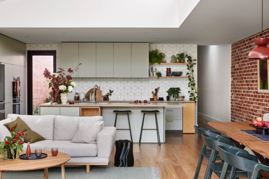
Vasette flowers and plants. Make Designed Objects homewares. Makers Mrkt and Rodwell + Astor vases. Tiento white matt diamond tile splashback.
Sage green cabinets complemented the indoor and outdoor greenery!
Southwood Home coffee table, side table and rug.
Rodwell + Astor pillows.
Marc Pascal ‘Eyoi Yoi’ light fixture.
A seamless transition to the outdoor garden!
Dowel Jones ‘Arcade’ pendant light. Southwood chairs.
‘Untitled’ artwork by Emma Creasey.
Tiento ‘Overlay Cotto’ and ‘Gesso Terracotta’ floor and wall tiles.
All the colour!
After living in their historic three-bedroom home in Melbourne’s north for five years — and dreaming of the endless renovation possibilities — couple Karl and Liz finally decided it was time for a makeover.
Enlisting Cantilever Interiors, their brief was to retain and enhance the period features of the original front rooms, while adding life and colour to the rear and a teenage retreat upstairs. The family also loved spending time in the back garden, so it was important for the new design to connect with nature.
Most of all, Liz and Karl wanted the home to reflect their personalities and the family’s daily needs. From adding shelves for their extensive book collection, to designing the perfect space for enjoying an afternoon cuppa, Cantilever took this concept and ran with it.
‘Beyond practicalities, I knew the importance of helping bring to life the once invisible outcome that made a home for all the pieces of each of them; the bag drop, the inherited furniture, the spice collection, the gaming couch, and looking over the garden while washing up’ Cantilever creative director Kylie Forbes explains.
An exposed brick wall in the living area was the starting point, providing a striking textural feature to the room that would become the backdrop for the remaining space. Coupled with cosy built-in bench seating and large glass windows providing views of the lush garden, the entire area feels open, airy and akin to a sunroom.
The burgundy tone of the brickwork also informed the colour palette throughout the rest of the dwelling. The bathroom, for example, features a deep red vanity complemented by peachy and terracotta tiling for a pop of colour!
‘I love the bathroom, which was probably the boldest design direction of the colourways,’ Kylie says. ‘The effect is so warm and glowy and I think because you have these different sensations in the rooms because of the different colours, it doesn’t seem out of place.’
On the other hand, light sage green cabinets in the kitchen make for the perfect backdrop to the light-filled living room and create a sense of harmony between the indoor and outdoor greenery.
But the colour doesn’t stop there. Green is also seen in the main bedroom’s wardrobes and sideboard, but in a lovely rich, warm shade — the perfect contrast to the deep blue tones of the walls that create a cosy space to retreat to at night.
Kylie adds that designing a visually pleasing and comforting home can only be done with care — and conversation. ‘Understanding that Liz shares a cup of tea with her sons when they get home from school, and designing a space with this in mind, is important,’ she says.
