Simone Haag On Elevating A Mid-Century Space With Layers Of Texture
Interiors
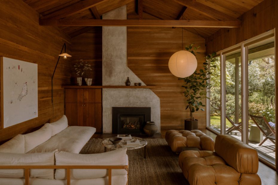
Joss House, designed by architect Pietro Belluschi. Interior decorating by Simone Haag. Photo – Pablo Enriquez
Joss House, designed by architect Pietro Belluschi. Interior decorating by Simone Haag. Photo – Pablo Enriquez
Joss House, designed by architect Pietro Belluschi. Interior decorating by Simone Haag. Photo – Pablo Enriquez
Joss House, designed by architect Pietro Belluschi. Interior decorating by Simone Haag. Photo – Pablo Enriquez
Find a unique response to a space or place, one that draws on context, narrative, personal style, functionality and all those beautiful parameters that become pillars of any interior design project.
For our studio, that is where the magic lies. The project that this moodboard is based off was a warm mid-century home in Portland, Oregon, originally designed by leading architect Pietro Belluschi.
We lent in to the existing style adding modern updates with furniture, art and objects. Below, we share some tips for how you can re-create the look at home:
Start by creating a moodboard and layer images and materials until the perfect balance of colours and textures is achieved.
Quiet junctures and subtle textural changes can make a space feel engaging and welcoming. The warm glow of a Noguchi lamp or the organic shape of a ceramic adds interest to an otherwise quiet space.
Incorporating visual elements that evoke the past is a huge part of what we are all about. Nostalgia is an emotional bond, and design is an emotional tool when wielded right so they live side by side. Sometimes we use heirloom furniture pieces handed down through generations; there may be an artist in the family whose works establish a palette and serve to anchor all the other furniture, lighting and objects; we might imbue homes with motifs and materials that trigger memories of travels; and we always ensure there is space for new pieces to be added so that the storied ambience of a place continues.
Don’t be afraid to break the style with something that you love. If you have an innate response to a piece, it will be timeless.
Additional moodboard credits: (from left) Wall tapestry, 1970s Spain, from 1st Dibs. Matteo rectangle wool & silk cushion and Rome bronze pure linen cushion from L&M Home. Small fluted bowl by Walk In The Park. Moon Jar and candlestick holder by Walk In The Park. ‘Coming and Going‘ by Joshua De Gruchy, from Brunswick Street Gallery. Raised bowl by Walk In The Park.
