A Brick Veneer Home Transformed To Embrace The Outdoors
Architecture
Park Street by Michael Ong Design Office (MODO) takes its cues from campsite living.
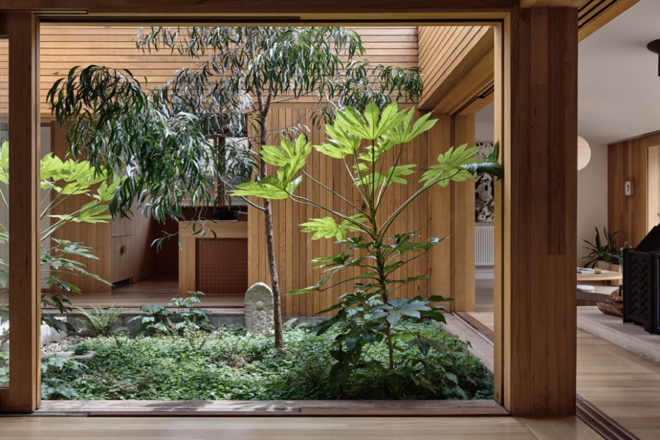
Straw Brothers designed the courtyard to inject light and greenery into the home.
The home encourages an outward perspective at every corner.
The floor becomes seating at the integrated, space-saving dining table.
The entire project was inspired by client’s desire for ‘non-attachment to non-valuable things’ in favour of priceless memories and intangible experiences: people in their home, conversations, trees, and the promotion of curiosity and contemplation.
The architects removed the second living room and bedroom area to make way for the internal courtyard.
Timber-rich interiors serve as a visual extension of the outdoors.
The home prioritises connection with nature, and one another.
The renovated kitchen remains in its original position.
Acacia implexa (lightwood), Fatsia japonica (Japanese aralia), and Viola hederacea (native violets) in the courtyard. An open air staircase connects to the upper storey.
Michael credits the courtyard designed by Straw Brothers as the most successful element of the project.
Tactile materials in the bathroom.
Timber and terrazzo bathroom accents.
Sliding doors were essential to this project and posed a unique challenge. ‘Our goal was to design doors that could completely slide away and disappear when pull open,’ explains Michael. ‘Seamlessly integrating the central courtyard with the rest of the home.’
Integrated nooks visually connect the interiors to nature.
The clients told MODO in their brief, ‘Bedrooms should only be slept in when ‘the sun has gone down and the campfire banter has subsided, and only because it might rain and there are mosquitos.’
A bedroom frames lush green views.
The original brick veneer facade of the existing home.
Where old meets new.
Regular engagement with the outdoors is required in order to reach the upstairs addition, which is only accessible via the courtyard’s open air spiral staircase.
The architecture is designed to recede into the landscape.
The view of the home from the steep backyard.
Architecturally-designed homes in the southern hemisphere are typically oriented so that the rear rooms — usually the main living spaces — receive optimum natural light.
Park Street by Michael Ong Design Office (MODO) takes a more comprehensive approach that ensures connections to natural light and nature throughout the entire home via a transformative internal courtyard.
This project was inspired by the client’s desire to champion what they value most: people in their home, conversations, nature, and the promotion of curiosity and contemplation. In other words, priceless memories and intangible experiences.
They likened their ideal home to an elevated campsite — a place that encourages more time spent outdoors than in, and precious moments engaging with others.
‘A home that provides just enough shelter for just those times where living, working, and playing outside isn’t possible,’ reads the client’s brief. ‘Like a permanent (or semi-permanent) tent, or series of tents, rather than a castle or the destination of itself.
‘Bedrooms should only be slept in ‘when the sun has gone down and the campfire banter has subsided, and only because it might rain and there are mosquitos.’
The clients told Michael, think of the house as the parents of a grown-up child. ‘They can provide shelter if they need to, but otherwise encourage independence and a life away from them.’
MODO completely reimagined the post-war brick veneer home, which was previously staggered into three loosely-defined tiers towards the back of the block.
The architects essentially removed the middle volume (previously host to a second living area and bedroom), making way for an internal courtyard and new living area to the east.
Much of the remaining floor plan was reconfigured within the existing envelope, alongside a new floor hosting an additional bedroom, bathroom, and study.
The new upper storey is timber-clad, creating a deliberate and distinct visual separation between the original brick home and the addition.
Michael credits the courtyard designed by Straw Brothers as arguably the most successful element of the project.
This outdoor space features few plant species, allowing an Acacia implexa (lightwood) tree and Fatsia japonica (Japanese aralia) to overtake the garden, with Viola hederacea (native violets) running rampant underneath.
It sits in contrast to the front and back yards — which are relatively steep and almost entirely lawned — to become the most accessible and interactive outdoor area on the property.
Frequent engagement with the outdoors is required in order to reach the upstairs addition, which is only accessible via the courtyard’s open-air spiral staircase.
Views to nature are the central focus of the home, while the architecture itself recedes into the landscape — just as the clients requested.
‘It’s a reminder that the most captivating spaces in a home aren’t always enclosed by four walls, a floor, and a roof,’ says Michael.
