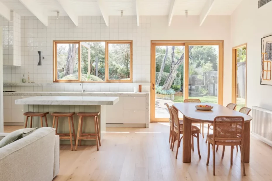
How To Create A Dreamy, Light + Bright Kitchen In Your Home
Interiors
The home of Sally Smith and Stuart Fahey. Dulux Natural White paint on walls and ceiling. GlobeWest sofa and stools. Nemo Lighting Applique de Marseille designed by Le Corbusier. Thonet No.811 Hoffmann chairs. Jardan Otis table. Lrnce artwork. Jenn Johnston Ceramics vases. Oko Olo Studio door handle. Woodcut Pale Oak floors. Photo – Eve Wilson
The home of Maddie and Mike Witter. Kitchen layout designed by @co_kitchens. Walls painted with Dulux Vivid White (wall and 2pac). Tap by Faucet Strommen. Linear Standard handles. Large painting by Anita Pumani. Small painting by Mark Alsweiler. Laminex Birchply Chalk cabinetry. Lambert et Fils pendant light. Kustom Timber floorboards. Caesarstone Cloudburst benchtop. Smeg stove. Photo – Eve Wilson
The home of Julia Busuttil Nishimura. Dining table from Grandfather’s Axe. Lola Terracotta Vase from Jardan. Lemmy Modular Sofa by Jardan. Cushion from Jardan. Woven basket from Pan After. Dining chairs by Thonet. Photo – Eve Wilson
The kitchen is undeniably one of the most important (and the hardest) rooms of the house to curate.
In addition to being highly functional, the kitchens we keep coming back to for inspiration are simple but never boring; minimalistic but not soulless. That’s because they rely on that timeless ‘light and bright’ style of interiors that never really goes out of style.
To nail this dreamy look, the best place to start is with a calming colour palette. Cabinetry is the perfect way to integrate neutral tones like olive and green-greys that will create some depth amongst your favourite white paint colours — and don’t be afraid to play with varying shades of white either to avoid making the backdrop look too stark and cold.
Timber is another key material in creating a warm and cohesive kitchen. Opt for lighter tones, like blonde woodgrain joinery, and a timber dining table in a blonde, washed out finish for a soft, coastal feel.
The lightweight silhouette of rattan stools and classic Bentwood chairs also work beautifully in this kind of kitchen where ‘less is more’. The same mantra applies for lighting: choose to hero one pendant or a sculptural wall light to create a subtle focal point in the space, without detracting from the overall palette.
Everything is quite restrained but there’s still room to have fun with some unexpected details. Inject a bit of personality with a terrazzo stone on the benchtop, or maybe a playful curved handle that catches your eye.
While function takes priority in the kitchen, that doesn’t mean you can’t showcase art and personal objects — just keep them elevated away from any messy benchtops.
In our moodboard above, we’ve selected the Sobremesa jug from HAY for its speckled pattern, an eb. Ceramics platter from Pepite and an artwork by Amy Wright that brings all the earthy tones and textures together!
Want to see more? Visit The Design Directory to discover our top picks in furniture, lighting, rugs and more!
