
Some people say that user experience is an invention of designers willing to increase the budget of a project. But an interface without UX is like a Tesla without batteries: you can turn the steering wheel but you can’t drive away. In the professional sense, design is not just a pretty picture but hard work based on scientific research and best practices. And the success of a product in the market largely depends on its design. Let’s see how experts create cool projects based on Gestalt psychology.
How the brain works when interacting with an interface
For designers, their work is not only about pictures, fonts, and colors. First of all, they seek to solve certain business problems. UX/UI professionals are constantly generating ideas, refuting or accepting hypotheses, and testing options to find the best way to resolve a specific issue.
One of these problems is the structuring of information. After all, a person constantly tries to systematize, modernize and control everything. This skill is vital since there are tons of content on the Internet. It usually takes 50 milliseconds for a user to perceive a page. If the eye has nothing to “catch”, a visitor abandons a website for something more interesting.
Over thousands of years of evolution, the human brain has learned how to structure information. Thanks to this quality, it began to group objects into a whole picture, saving energy and automating processes. Now it works almost instinctively.
Can you see an object in the picture below? What is it? Right you are, it’s a tree.

But you don’t notice its parts at first glance (the trunk, leaves, cones, branches, and so on). Your brain sees a whole picture and understands that this object is a tree.
Why does this example matter? When interacting with an interface, the same neural connections are activated in the brain as when interacting with real physical objects.
The picture below shows an interface divided into separate grouped elements. When a person looks at it, their brain tries to isolate some groups and operate within their framework.

What does psychology have to do with mobile app UI design?
At the beginning of the 20th century, German scientists defined such a concept as Gestalt. Understanding the above mechanisms and cognitive features of the brain helped them do it. The word itself is translated as “form” or “structure”. It refers to the principle that a structured whole is more than the sum of its parts.
Laura Busche said that experienced designers are fully aware of the role of psychology in visual perception.
The work of a designer is facilitated by the fact that people intuitively try to isolate, structure, and find the simplest solution to achieve their goals. Thus, all designers need to do is create the right triggers that will work, including those based on Gestalt principles.
Visualization and psychology are closely related, and Gestalt principles control these connections. Let’s consider what principles of psychology help interface design studios create convenient and useful products.
The proximity principle
Proximity is one of the crucial concepts in Gestalt design. It means that interconnected elements should be close together, and those with weaker connections should be placed farther apart.
Everything is quite simple. However, in practice developers and designers often ignore this technique. In this case, blank space (or negative space) plays an important role. It adds hierarchy to a picture and helps you visually determine if objects are close.
In the example below, you can see objects divided into three groups.

If you add color, you can see that the law of proximity is not violated because the distance is preserved and the objects remain in their places.

The same thing happens if you change the shape of an object. This means that proximity is more important than form and even color.
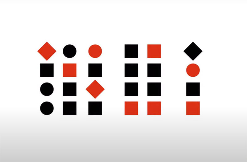
Everything happens differently if objects are located at an almost equal distance.

Here, we see the principle of similarity in color which is close to the proximity principle. In turn, the objects are combined more densely by shape and color. If effects of similarity are based on shape and size, they will simply overlap if objects are similar in color.
Let’s take Google search results as an example. Elements are laid out clearly and intuitively, and users won’t have questions about performing a search.

The power of the proximity theory: an example
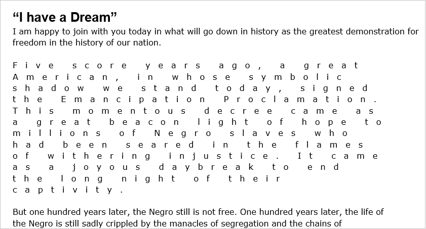
The proximity theory applies to any text. People are used to the distance between letters being shorter than between words, and due to this, a text is readable.
Let’s assume that the spacing between words is equal to the spacing between letters. It’s embarrassing.
Source: office-watch.com
If you shorten the distance between letters, you get a more familiar picture. A problem is easily fixed by simply adding line spacing of the desired size.
Let’s assume that we need to place more text on a plate. In this case, the proximity theory will work like gravity. Small objects are attracted to larger ones, and the border (frame or book cover) acts as a black hole that has an external attraction. To eliminate this, you need to remember that the outer spacing must be greater than the inner indents (between paragraphs).
When adding a heading to complete a picture, you need to place it close to a paragraph and give more space to the outer borders.

This gives a complete picture of the correct use of proximity theory.
The common region principle
This one not only helps to create a set of objects and content but also to separate them. Different features, such as lines, shadows, or background, can be used to combine objects.

Let’s take this picture as an example:

The Von Restorff effect
This is a powerful Gestalt law. From several similar objects, a person remembers the one that is logical and stands out. On the contrary, people tend to forget less noticeable objects.

Web design debt and development companies apply this principle on a huge scale. For example, on the rate increase page in Google Drive. It is relevant for each user depending on the amount of space they use.

Source: https://www.gemrajtechs.com/google-one-100gb-cost-k.html
Hick’s law
This one is less about Gestalt and proximity but designers find it important. It was discovered by two psychology professors, William Edmund Hick and Ray Hyman. Scientists conducted a series of experiments to understand how much time people spend making a choice.
To do this, they made a special device. It was based on 10 light bulbs to which 10 buttons were connected. As soon as the bulbs lit up, a person had to press certain buttons, from two to ten. Scientists found that the more objects a user sees, the more time they spend making a choice.
An interface is erroneous if people are given plenty of elements to choose from. It is very difficult for a person to choose what they need.
Therefore, you should limit the number of objects to select. This is where the following rule helps app design studios.
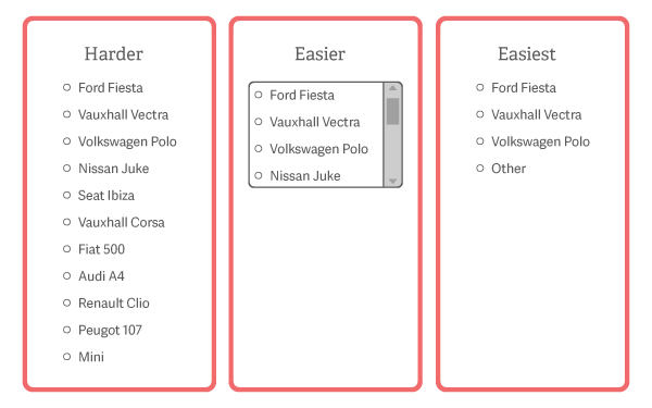
The magical number seven, plus or minus two
George A. Miller specified the previous law by indicating figures. The scientist determined the number of options that is convenient for a person to choose from. He started from such concepts as the economy of the brain when it is looking for the shortest and easiest way to complete a task.
Take, for instance, choosing a delivery city on a site that sells equipment:

Source: gizmotimes.com
At first glance, it seems that the cities are structured alphabetically, and everything is clear. But due to the overabundance of names, it is difficult to make a choice. In this case, a more convenient option is to add a list of the most popular delivery cities, a search engine for settlements by name, and a map with a selection of the desired points.
Conclusion
Enterprise website designers find the psychology of visual perception very important. However, you shouldn’t use Gestalt principles as rigid restrictions or prohibitions. Try to regard them as a useful tool that makes an interface better, more intuitive, and more enjoyable.