Trending: Chartreuse’s Unexpected Comeback + How To Make It Work
Interiors
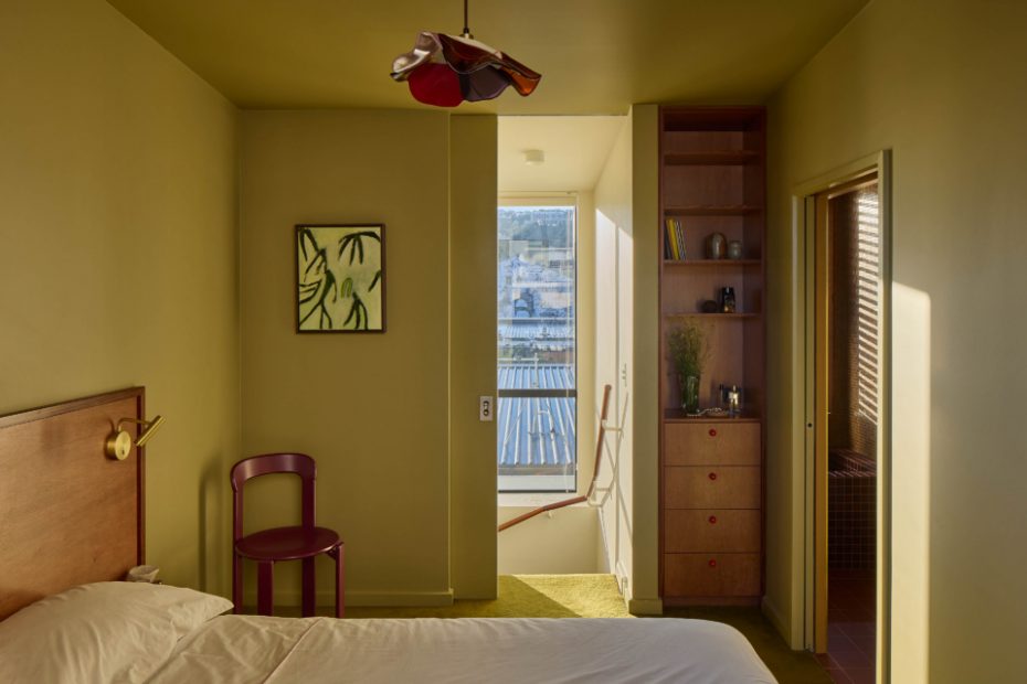
Paddington by Natalie Bradburn Studio and Lucy Coote of Salad Days Ceramics. Bed by Woodwrights. Custom carpet by Cronz. Linen by Sutram. Bedside lamps by ECC. Custom wardrobe handles by Natalie Bradburn Studio. Artwork: ‘How I Keep from going under I’ by James Watkins (2025), sourced from Twenty Six Gallery. Curtain in James Dunlop Element fabric. Photo – Simon Wilson.
Paddington by Natalie Bradburn Studio and Lucy Coote of Salad Days Ceramics. Bed by Woodwrights. Bedside lamps by ECC. Curtain in James Dunlop Element fabric. Photo – Simon Wilson.
Paddington by Natalie Bradburn Studio and Lucy Coote of Salad Days Ceramics. Custom carpet by Cronz. Photo – Simon Wilson.
Paddington by Natalie Bradburn Studio and Lucy Coote of Salad Days Ceramics. Clerici Chair by Mattiazzi, sourced from Simon James. ‘Shy Guy’ by Reece King (2025), sourced from Peg Gallery. Custom carpet by Cronz. Photo – Simon Wilson.
Paddington by Natalie Bradburn Studio and Lucy Coote of Salad Days Ceramics. Mobile by Kate Mitchell Glass. Cot by Kalon Caravan. ‘Gummi Venus’ by Emily Hartley Skudder, sourced from Jhana Millers Gallery. Custom carpet by Cronz. Photo – Simon Wilson.
The View by Studio Sheilds. Art (from left) by Ro Noonan, and Martyn Thompson. Shelving (from top left) Matchstick Bowls by FDO Studio from Pepite, Candle Sticks by Locki Humphrey. Bench (from left) EROS#1 vase by Martyn Thompson from Oigall Projects, ‘Void I’ Sculptural Vessel by Steph Wallace from Craft Victoria, Trophy #4 by Alterfacts from Pepite, ‘Resilience -May We Grow Tender’ by Astrid Salomon/ Bastard Ceramics from Craft Victoria, Green vase by Tantri Mustika Ceramics. Cushions by Tali Roth, Oat Studio, and Emma Shepherd. Sequence Floor Lamp by Objects for Thought. Wade Table by Jordan Fleming. Mossy Platter by Rina Bernabei. Trophy #2 by Alterfacts from Pepite. Drip Urn by Kelly Brownfrom Pepite. CONTAINA side table by Dean Norton. Vintage Playpen sofa by Simmons. Rug from Afrikesh. Photo – Martina Gemmola
Alex Telford-Sargeant’s eclectic East Melbourne apartment. Custom chartreuse paint to contrast the ‘Aperol spritz’ vibe in the lounge room! Cane side chair from Swanpool Antiques. Photo – Eve Wilson. Styling – Sarah Hendriks.
Alex Telford-Sargeant’s eclectic East Melbourne apartment. Two Boats artwork by Margie Sheppard. Early 20th century oak side table from Leonard Joel. Small oil painting from a Marseille market. White uplight purchased from a Euroa op-shop. Photo – Eve Wilson. Styling – Sarah Hendriks.
Kollab directors Hayley and Mick Barrett’s beachside family home by Pleysier Perkins. Escape Velour carpet in Esther by Supertuft. Chairs designed by Grant Featherston. Nesting tables by Kartell. Stool by Karoma. Photo – Eve Wilson. Styling – Sarah Hendriks.
No colour divides a room quite like chartreuse.
Years ago, while presenting a bedroom scheme, I included a chartreuse accent. Before I could even explain my reasoning, the client interrupted to tell me, in language far stronger than I can repeat here, that she found chartreuse absolutely disgusting.
I understand where she was coming from. Chartreuse is an unusual acidic yellow-green, but I am here to defend it.
David Hockney famously declared that ‘there are no off-putting colours, only off-putting combinations.’
To this statement, I could not agree more. I will concede that chartreuse doesn’t look great in all situations. When paired with orange or pink, for example, it feels juvenile, and against black or white, it’s too jarring.
The shade has drifted in and out of fashion for centuries. It appeared in luxurious silk gowns during the late nineteenth century; Vincent van Gogh used it to illuminate the night sky in Café Terrace at Night; the 1990s embraced it with characteristic enthusiasm; and more recently, we’ve seen its distant cousin emerge through the slime-green optimism of Brat Summer. More recently, Vogue published ‘Chartreuse Is Spring’s Newest It Color’ — who am I to argue with Vogue?
You can’t really be neutral about chartreuse. It’s not a safe colour. It’s not a people-pleaser. Nobody accidentally ends up with a chartreuse armchair.
Chartreuse reminds us that good design isn’t about consensus. The most memorable interiors are rarely built from universally loved choices; they’re built from conviction. The homes that stay with us have a point of view. They introduce a colour, material or piece of furniture that not everyone would choose.
Chartreuse is one of those colours. It’s a little strange, a little difficult. Occasionally misunderstood, and sometimes, those are exactly the qualities that make something beautiful.
Choosing chartreuse requires a level of confidence. A willingness to trust your own eye rather than follow a formula.
Which is why, when it’s done well, it looks fantastic.
How to use chartreuse in your home:
A floor rug is the perfect way to introduce this offbeat shade to make your space really feel different. It works so well with timber tones, so layering over a floor and combining with earthy tones would be the best backdrop to furnishings.
An accent piece, such as a chartreuse side table, really lifts a space by adding that zing every room needs to stop feeling flat. Because of its intensity, chartreuse sings when used as a high contrast feature. A chartreuse fabric armchair or ottoman can be a great option, or even cushions and throw blankets.
Chartreuse looks best paired with deeper colours. Use brick red, burgundy and navy as grounding colours to contrast the brightness of the green. Likewise, alongside espresso and chocolate, it feels natural, earthy, and strangely elegant.
If you’re feeling truly adventurous, colour-drenching an entire room in chartreuse can be surprisingly beautiful. The trick is to balance it with deeper, moodier tones and choose a room that isn’t flooded with bright sunlight. Chartreuse thrives in spaces with a little shadow, a little mystery.