This Sydney Terrace House Hides A Surprisingly Fun Renovation
Architecture
House in Surry Hills is a terrace renovation by Studio George.
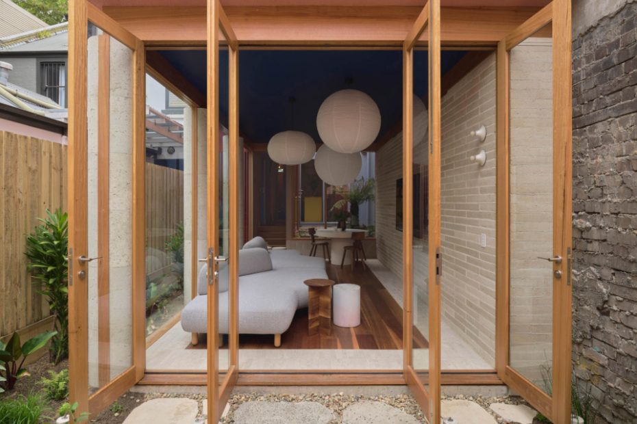
A wall of cream brick runs along the length of the living room.
Timber-framed glass doors open the living ‘pavilion’ to the courtyard garden.
Custom brick pillars support the pink sculptural, vaulted forms on the second floor of the home, without obstructing the garden views.
The living room features a border of limestone tiles around a clever timber ‘rug’.
‘Our clients aren’t big cooks, so the kitchen was designed as a colourful and functional space, but not one that was occupied for long periods of time,’ Studio George director Dean Williams says.
A small courtyard and the rear gardens envelop the floorplan in greenery.
A moody midnight blue cloaks the ceiling, joinery and bathroom upstairs.
Timber floors create a cohesive backdrop for the playful spaces inside.
At the rear, an additional pavilion houses the garage and an office.
The front of the Surry Hills terrace.
This 1880s Victorian was uninhabitable when Studio George’s clients purchased it a few years ago.
‘The home had undergone a renovation in the 1970s and hadn’t been touched since. It was stripped of most of its original ornate detailing,’ Studio George director Dean Williams says.
It gave the owners, a young professional couple who had lived in apartments their whole lives, an opportunity to really make the place their own — guided by Studio George’s confident creative approach.
‘They desired a home that had individuality and reflected their personality — not just a typical home with typical finishes and colours’, he adds. Colour was a big part of the brief, requesting playful hues that could ‘heighten their mood’.
‘Complimentary to the rich colour expression, they wanted the home to utilise natural materials such as Australian hardwood timbers and handmade tiles,’ Dean says.
The work of famous Mexican architect Luis Barragan influenced the resulting home’s colour-blocked forms.
The facade is now cloaked in a lavender-blue shade; the kitchen reveals mustard joinery with a yellow splashback; and the removal of the damaged rear wing made way for a living pavilion topped with elevated sculptural blocks — rendered in a dusty terracotta pink.
Supported by custom brick pillars inside, the pink-clad upper level was designed to almost ‘float’ above a row of timber-framed glass doors, which open to the surrounding courtyard gardens.
‘As the gardens continue to grow, they will envelop the living space, providing dense greenery to all edges of the home,’ Dean says.
‘It was critical for the same material and colour be used on the walls and roof of the pink pavilions. We worked closely with the render company to ensure this material could wrap seamlessly from the walls, up onto the roof and into the concealed gutters.’
The interiors balance vibrant moments like the blue ceiling the with more earthy accents and paper lantern pendants. And the genius decision to line the border of the living room with limestone tiles makes the spotted gum flooring appear as if it was a timber rug.
Upstairs, the two existing bedrooms were reconfigured to provide a bedroom, study and family bathroom — all united by singular swatches of deep blue.
‘We are quite proud of our (somewhat fearless) material and colour experimentation,’ Dean says. ‘We never chose an easier way to design or detail the building, as we were constantly striving for that individual architectural expression that our clients wanted.’
It took a year to design and a year to build, but the team’s close attention to detail makes House in Surry Hills stand out, in the best way. It’s now a one-of-a-kind oasis that sparks joy everywhere you look.
