A Light-Filled Extension For A Classic Red-Brick Home
Architecture
‘I love that the extension feels like a natural continuation of the original home, even though its formal and spatial expression is quite different,’ BENT Architecture director Paul Porjazoski says.
Demolishing the home’s original 1970s extension, space was created to consolidate the kitchen, living and dining spaces into a single shared area leading to the garden.
Ines Ceramic Wall Sconce by Few and Far.
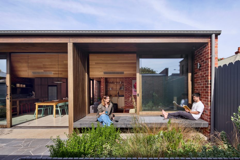
Red-brick continues in the renovated living and dining space which is filled with natural light.
Zalo Double Kitchen Sink in Brushed Gunmetal by ABI Interiors.
Arute Saita Border ceramic glazed finger tiles from Artedomus.
Timber and red-brick in the kitchen create a sense of warmth.
The renovated rear extension of the home continues with the red-brick style.
The Princes Hill home’s iconic red-brick facade.
The floor plan.
This Princes Hill home’s iconic red-brick Victorian exterior is a staple in its neighbourhood.
While the family loved its facade, the house’s 1970s rear extension made the home feel closed-in and dark — the time had come for a much-needed renovation.
They entrusted BENT Architecture director Paul Porjazoski with maintaining the house’s red-brick style, period detailing, solid insulated structure and original central corridor and pine floors, while opening up the living areas and connecting the home to the garden.
Paul expertly expanded the home for functionality, keeping the new work largely invisible from the street view.
‘The property is covered by a heritage overlay, so the new work needed to respect the established heritage character of the area,’ Paul explains. ‘This was achieved by retaining the original period façade and concentrating the new work at the rear of the site.’
The renovation left the original front rooms structurally unaltered and transformed the existing living room into a main bedroom.
The 1970s addition was almost entirely demolished as its low ceiling and small windows didn’t take advantage of the north-facing side of the property.
The new extension makes space for an open-plan kitchen, living and dining area that open out onto the backyard. An existing outbuilding at the rear of the property was also repurposed as a studio with its own en suite.
New timber walls and ceilings help blur the distinction between inside and out. Paul explains, ‘[These additions] create a space that feels both enveloping and protective, but also deeply connected to the garden and natural light.’
‘There is a sense of calm that comes from having nature so closely connected to everyday life,’ Paul says.
The home’s red-brick facade was the clear material reference and inspiration for the renovation: to connect the old with the new.
‘We separated the new work from the original house to give the living zone space to breathe, while celebrating the red brick that is synonymous with both the original house and Princes Hill more broadly,’ Paul says.
‘I love that the extension feels like a natural continuation of the original home, even though its formal and spatial expression is quite different,’ says Paul.
Paul believes any addition to a home should reinterpret its original character in a contemporary way, which is exactly why he loves the outcome of this project.
‘The challenge is to create something that feels genuinely new and transformative, while also feeling as though it belongs specifically to that house and that place. At Princes Hill House, I think we achieved that.’
Sign up to The Design Files free newsletter to get our best articles sent to your inbox.